netTerrain 9.5 Power User Guide

Document Code. GN_D_nT9-02 Last revision: 08/10/2022
© 2022 Graphical Networks LLC. All rights reserved.
Graphical Networks and netTerrain are registered trademarks of Graphical Networks LLC. Other product names mentioned in this manual may be trademarks or registered trademarks of their respective companies and are hereby acknowledged.
If rash, irritation, redness, or swelling develops, discontinue reading. Safety goggles may be required during use. Do not eat this guide. This disclaimer is not intended as legal advice. For that, better call Saul.
Image: Black Forest, Germany.
Graphical Networks LLC
Telephone: + 1 - 240 - 912 - 6223
Fax: +1- 240 - 912 - 6339 (anybody still uses these?)
1 About this guide
This document is divided into the following chapters:
-
Chapter 1, “About this guide”.
-
Chapter 2, “Catalog Basics”.
-
Chapter 3, “Creating and modeling DCIM types”
1.1 Who should use it
A netTerrain Power User can modify any data in the project (the end user work area) but is also tasked with managing catalog settings and their associated object types, such as nodes, devices, racks, cards and links. This is guide is then for you, dear Power User.
1.2 Assumptions
This guide assumes basic knowledge of browser navigation and general computer and networking knowledge. We also expect you to know the basic aspects of netTerrain project management (navigation, object manipulation, etc.).
2 Catalog basics
The netTerrain catalog is the place where power users or administrators can create and manage netTerrain types, which include nodes, devices, racks, cards and links, among other objects.
Throughout this guide we will also make several references to the project, which is the user area where diagrams are created.
Also, it is important to differentiate a so-called “instance” from a type. A type is an object created in the netTerrain catalog, which has certain properties and behaviors. Types are then “instantiated” in the project. So, for example we may have a type called “chair” in the catalog, and an instance of that chair on the top left corner of room 1A in the project. A less generic example (better suited for netTerrain DCIM) would be a type called “Cisco 6509” and an instance, such as the “main Pittsburgh ring 6509 switch”, with a DNS name “Pit-6509-1”. In this latter example “Pit-6509-1” will inherit all the common properties defined in the catalog for the Cisco 6509, such as width, height, backplane image, peak power consumption, slots, motherboard ports, etc. The instance can also contain properties all its own, such as an IP address, MAC addresses, rack position, supervisor pager #, and so on.
2.1 Accessing the catalog
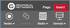
The catalog console area is restricted to users with admin or power user permissions. First, you must log into netTerrain and then to access the catalog simply click on the catalog button, displayed in every netTerrain page right there on the top right section of the page, as depicted below:
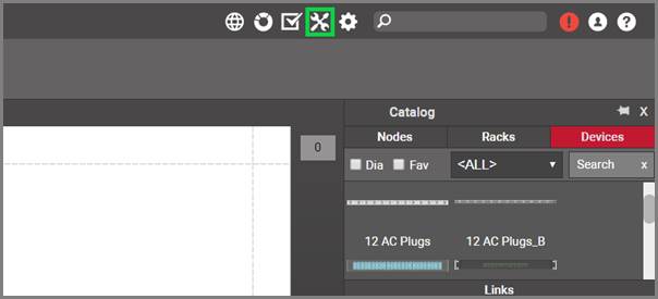
Accessing the catalog
You may access the catalog from the project or the admin console, since this button is visible in any view in netTerrain (assuming you are a Power User or better, of course).
If you want to return from the catalog to the project, you can do the following:
- Click on the project button, which takes you back to the project’s top level
- Click on the left arrow, to the left of the project button, which takes you back to the last diagram you visited in the project
- Click on the browser back button, which will take you to the previous project diagram if you came from the project during the current session

Using the project button and arrow to return to the project
2.1.1 Accessing a specific node type directly from the project
netTerrain has a nice shortcut to access a node type directly from the project. Simply double click on the node type in the catalog pane (on the project), and netTerrain takes you straight to the catalog, displaying the type in the node type list view.
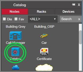
Double-clicking on node item in catalog pane
This shortcut comes in handy to get directly to a catalog definition of a node without having to click through several pages. Notice that you still must be a power user or administrator to take advantage of this feature.
2.2 Summary and groups
Once you click on the catalog button, you will access the so-called catalog dashboard, which consists of several sections, including one concerning object types (more on the other sections later).
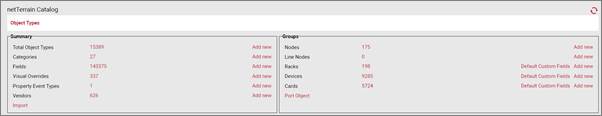
Object type section of catalog dashboard
Below is a review of the different links associated with the object types section:
Summary
- Total Object Types: click on the # value to open a table view of all object types within the netTerrain catalog.
- Fields: click on the # value to see a table view of fields within netTerrain for all object types.
- Visual Overrides: click the # to open a table view of all fields that have visual overrides.
- Vendors: click the # to open a table view with a list of vendors in the current catalog.
Groups
-
Nodes: click on the # value to open a table view of all node types within the netTerrain catalog.
-
Rack: click on the # value to open a table view of all rack types.
- Devices: click on the # value to open a table view of all device.
- Cards: click on the # value to open a table view of all card types.
- Port Object: This is a shortcut to the port node type in the catalog.
Each section also has a link to create a new catalog entry directly from this view. Racks, devices and cards also have a link to create default custom fields (more on that below).
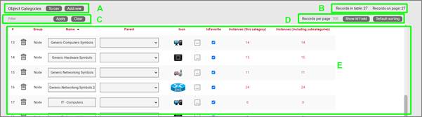
2.3 Object types
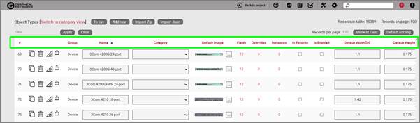
The ‘total object types’ section provides a list view of all the objects (nodes, racks, devices, cards) that exist in the netTerrain catalog.
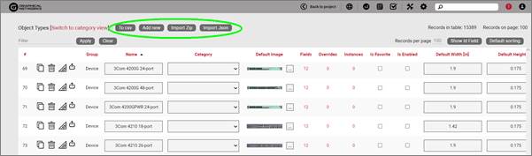
Total object types list view
The elements that comprise this view include:
Section A
- To CSV: this button allows you to export the table view to a downloadable CSV file.
- Add new: selecting this will display a form to create a new object.
- Import Zip: Allows you to import a netTerrain device package as a zip file.
- Import Json: Allows you to import a netTerrain device package as a Json file.
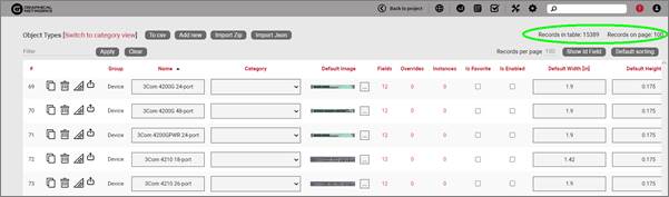
Section B
- Records in table: displays the total number of objects in the table. For example, if this is the nodes view then this will display the total number of nodes in the catalog.
- Records on page: displays the total number of records on the table page that you are currently viewing.
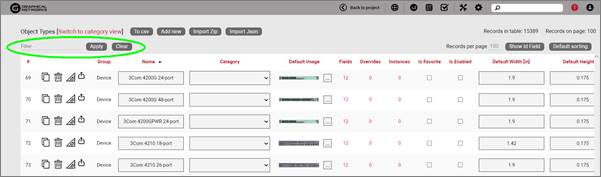
Section C
Filter: allows you to filter information in the current table view. If you would only like to display the objects related to “Cisco” in their name, then type “Cisco” into the filter box and press the ‘Apply’ button. You can change the filter by simply typing in a different string and pressing the ‘Apply’ button. If you no longer need the filter, press the ‘Clear’ button to remove the filter.
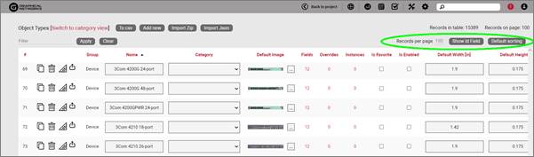
Section D
- Records per page: you can change the records per page value to a value that is less than the default value. Note that the default value is set in the admin console and can only be changed by an administrator.
- Show ID Field: hides or shows the ID value for the record. The ID value is the unique ID that is assigned to each record in netTerrain.
- Default Sorting: if you sorted the table by a column name and would like to return the table to the default sort value, press this button. The default sorting for a table view is by “Name”. Changing the default sorting is temporary. The default is restored once you navigate away from the table view.
Section E
- #: the row number for the current table view. This will change depending on the filter, sort value or number of records per page. Bear in mind this # is just a reference to the order in which the record appears in the visual representation of the information on the table and has no relationship to the actual data stored in the database.
- Options (no label): the ‘Delete’ option allows you to delete an object. Note that you can only delete an object if it is not being used in netTerrain. If it is being used, you would need to remove all instances of the object before you can delete the object.
- Clone: this hyperlink, as the name implies, allows you to clone the type. It creates an exact replica with the type in the catalog, which you can then edit, rename, etc.
- Delete: this hyperlink, when enabled, lets you delete the type from the database. If instances of this type already exist, then the type cannot be deleted.
- Modeler: for devices, racks and cards, this hyperlink provides a shortcut to access the modeler page for that type (more on modeling can be found later in this guide).
- Group: every object type is associated with a certain internal group in netTerrain. The assigned group will be one of the following: node, rack, device, or card. Groups are fixed in netTerrain and cannot be edited, and new groups cannot be added.
- Name: the object’s name, which can be changed by editing the text field.
- Category: the category is used as an organizational tool to help you manage and find objects according to custom categories that better suit your needs (more on categories later),
- Default image: the image that will be displayed for any new instances of the object. If there are visual overrides, these will override the default image when the visual override is triggered (more on that later).
- Fields: this number reveals the fields associated with the object and displayed a table with all those fields (more on this later).
- Overrides: overrides are rules associated with one or more fields for that type. Clicking on the overrides # will redirect you to a table with all assigned overrides (more on that later).
- Instances: the number of instances that are active objects in the project. Clicking the number will provide a table of these instances. Note that this table is also editable, which can provide a useful way for quickly changing instance data in table view.
- Is Favorite: when checked, this object will appear in the object’s type menu button in the project area or in the drag and drop catalog pane.
These menu buttons will be populated with a favorites list. Favorites can be added or removed at any time. They have no impact on existing objects in a diagram.
- Is Enabled: when checked, this object will be available to users in the project area as they pick an entry from the type drop down field. Objects marked as favorite cannot be disabled. You must first uncheck the favorite option before disabling it.
- Default width: the assigned width when a new instance is created. The instance’s value can be changed as needed. To change the default width value simply edit the text field. The default size of an object can also be changed when right clicking on an object in the project and choosing the ‘set default size’ option.
- Default height: The assigned height when a new instance is created. The instance’s value can be changed as needed. To change the default height value, edit the text field. The default size of an object can also be changed when right clicking on an object in the project and choosing the ‘set default size’ option.
- Keep aspect ratio: when checked, the ratio between height and width of the image will remain intact when expanding or decreasing the object’s image in the project area. This can also be changed on an individual basis for each instance within the setting window for the object (see User’s guide).
- Template: this drop-down field assigns a default diagram template (see creating diagram templates in the user guide) to the sub diagram of any new instance of that object type. So, any time this object is used in the project (i.e. an instance of it is created) its sub diagram will have this template automatically assigned.
- In Stock: this option lets you limit the number of instances of this type that can be added in the project. Notice that this option is only available for Racks and devices.
- Audit Trail: this link will take the user to a table consisting of a history of specific user’s actions associated with the object type. Note that the audit trail can only be accessed by administrators.
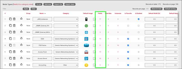
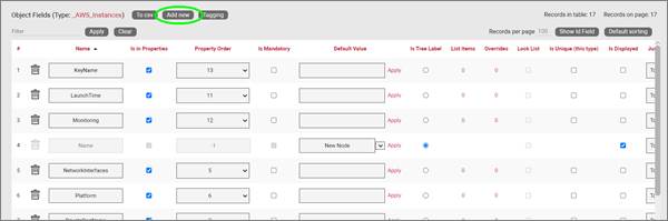
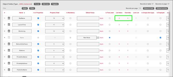
2.3.1 Object fields
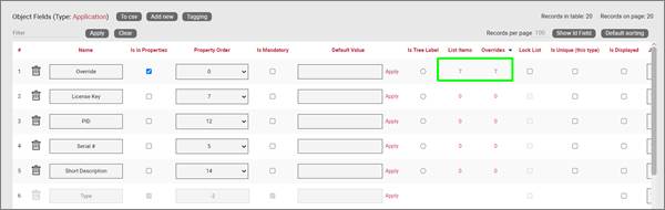
The ‘Fields’ link will open a table with all fields associated with all objects in netTerrain. Below we will review the elements comprising this list view, but in general we do recommend accessing the field list for a given object directly from the object itself (see Fields option above).
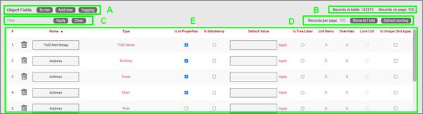
Field list view
Section A
- To CSV: this button will export the table’s data into a downloadable CSV file.
- Create new: clicking this button will display a form for creating a new field.
- Tagging: the tagging button opens a tagging selection dialog, allowing you to assign a set of fields to a “Tag” (a label). All existing tags appear in the settings tab for a diagram in the netTerrain project. Fields associated with a tag label can be turned on and off within a diagram. So, you could assign a field like IP Address to a “Hide IP” tag. If you happen to be on a diagram that has objects containing that field, you could then turn on or off all IP Address fields without having to individually uncheck them from the properties window for each instance.
Section B
- Records in table: Displays the total number of fields in the table.
- Records on page: Displays the total number of records on the table page that you are currently viewing. The records per page default value can be set by the administrator within the admin console.
Section C
- Filter: allows you to filter information in the current table view. If you would only like to display the fields called IP Address, then you simply type in the search criteria into the filter box and press the ‘Apply’ button. You can change the filter by simply typing in new criteria and pressing the ‘Apply’ button. If you no longer need the filter press the ‘Clear’ button to remove the filter.
Section D
-
Records per page: you can easily change the records per page value to something less than the default value. So, for instance if the default is 100 records per page and you would like to see 50, simply proceed to change the value. Note that the default value is set in the admin console and can only be changed by an administrator. You cannot exceed the maximum number of records per page that was set within the admin console. If the maximum records per page is 500 then you will not be able to set a value higher than 500.
-
Show ID Field: hides or shows the ID value for the record. The ID value is the unique ID that is assigned to record in netTerrain.
- Default sorting: if you sorted the table by a column name and would like to return the table to the default sort value press this button. The default sorting for a table view is by “Name”.
Section E
-
#: the row number for the current table view. This will change depending on the filter, sort value or number of records per page. Bear in mind this # is just a reference to the order in which the record appears in the visual representation of the information on the table and has no relationship to the actual data stored in the database.
-
Options (no label): right next to the # button there are two options under a blank heading (‘Apply’ and ‘Delete’). Using the Apply button will assign any settings that are changed for this field to all instances of the object that the field is being used on. Selecting Delete will remove the field record. If the field is in use and there is data being stored within the field all this data will be lost, so be careful when using this option.
-
ID: Displays the unique netTerrain system ID for the object.
-
Name: the field name that will be displayed for the associated object type.
-
Type: this is the name of the object where this field is used.
-
Is in properties: this feature is useful to control what end users can see on the properties window for a given instance of that type. For example, you can uncheck a field and prevent end users from seeing the data associated with the instances on the project.
-
Is mandatory: if this option is checked it means that some data must be entered into the field when an object instance is created in the project. This is typically used in conjunction with an assigned default value to ensure some data is entered into this field. This field also cannot be deleted if the mandatory check box is enabled.
-
Default value: this is the default value that will be displayed for a given field when a new instance of the object type is created.
-
Is tree Label: determines the data value that will be displayed in the hierarchy browser. Change this if you want to see a different value displayed for an instance of this type in the hierarchy. The default is typically the name.
-
List Items: list items are like drop down boxes (or combo boxes) that offer end users a finite set of values available for data entry on a given field for a given type. Click on the value to open a table with all list items associated with this field and object type.
-
Overrides: click on the value to bring up a list of the overrides associated with this field and object type.
-
Lock List: Allow an override list to be non-editable. If this is checked then a user cannot override the list values. They must choose a value that is already in the list.
-
Is Unique (this type): Restricts all new inputs of this field for this object type to be unique across all instances.
-
Is Unique (all types): Restricts all new inputs of this field for any object type to be unique across all instances.
-
Is displayed: when checked, the field’s value will be displayed on the diagram for an instance of this object type. This can also be controlled on an instance basis as well as type-wide (see End User Guide).
-
Justification: sets the alignment. See the settings for the field instance for more alignment options.
-
Font color: the color of the text value that is displayed in the project area diagram for this field. Note that you can change the font on an instance by instance basis from the project as well (see End User Guide).
-
Fill color: the background color of the text that is displayed in the project area diagram for this field. Note that you can change the fill color on an instance by instance basis from the project as well (see End User Guide).
-
Font size: the size of the text that is being displayed in the project area diagram for this field. Note that you can change the font size on an instance by instance basis from the project as well (see End User Guide).
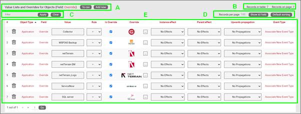
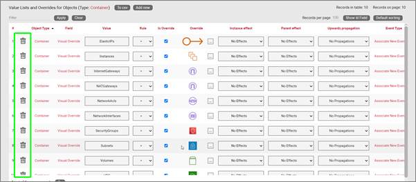
2.3.2 Visual overrides for objects
Visual Overrides are in important feature in netTerrain akin to ‘business rules’ that change the appearance of an object when a certain attribute matches a specified value.
For example, a Power User may set up an override for a field called ‘status’ for an object type called ‘Router’, such that when the value for status is equal to ‘alarmed’ then the router icon turns red.
The ‘Overrides’ link will open a table with all overrides associated with all objects in netTerrain. Below we will review the elements comprising this list view, but in general we do recommend accessing the overrides list for a given field directly from the object itself.
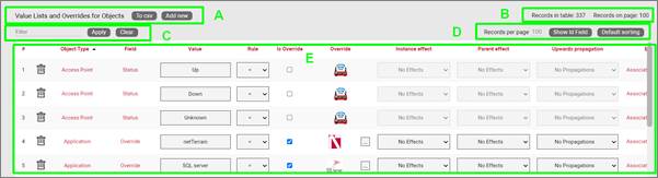
Visual overrides list view
Section A
- To CSV: this button will export the table’s data into a downloadable CSV file.
- Create new: clicking this button will display a form for creating a new override.
Section B
- Records in table: displays the total number of overrides in the table.
- Records on page: displays the total number of records on the table page that you are currently viewing. The records per page default value can be set by the administrator within the admin console.
Section C
- Filter: allows you to filter information in the current table view, in the same way as the filters are used for field or object lists.
Section D
- Records per page: you can easily change the records per page value to something less than the default value. So, for instance if the default is 100 records per page and you would like to see 50, simply proceed to change the value. Note that the default value is set in the admin console and can only be changed by an administrator. You cannot exceed the maximum number of records per page that was set within the admin console. If the maximum records per page is 500 then you will not be able to set a value higher than 500.
- Show ID Field: hides or shows the ID value for the record. The ID value is the unique ID that is assigned to record in netTerrain.
- Default sorting: if you sorted the table by a column name and would like to return the table to the default sort value press this button. The default sorting for a table view is by “Name”.
Section E
- #: the row number for the current table view. this will change depending on the filter, sort value or number of records per page. Bear in mind this # is just a reference to the order in which the record appears in the visual representation of the information on the table and has no relationship to the actual data stored in the database.
- Delete option (no label): selecting ‘Delete’ will remove the override record.
- Object type: the object with the field that is assigned the override.
- Field: the field with the list or override.
- Value: value of the list or override data. Project instances will switch to the override image when that field contains the same value displayed in the override.
- Rule: the condition that determines how a visual override is used in the project.
- Is Override: Sets the field to be an override type.
- Override: the image (or override itself) that will be used if the rule criteria is met.
-
Instance effect: in addition to visual override for an object, rules can be set for additional effects that affect the object itself or the containing object (or entire ancestry) whenever the rule criteria applies. The following effects are currently available for visual overrides in netTerrain:
-
No effects: this is the default, which means that no effect applies to the object instance when the rule is met.
- Blink object: the object will blink on the diagram when the override criteria is met.
- Rectangle blink: the object will display with a blinking rectangle that outlines the object.
-
Red triangle indicator: the object will display with a red triangle.
-
Parent effect: as mentioned above, effects can propagate to the affected instance’s parent object or objects. The following options are available:
-
No effects: this is the default, which means that no effect applies to the parent object of the instance that matched the rule.
- Blink object: the objects parent will blink on the diagram when the override criteria are met.
- Rectangle Blink: the objects parent will display with a blinking rectangle that outlines the object.
-
Red Triangle Indicator: the objects parent will display with a red triangle.
-
Upwards propagation: you can not only assign effects to the object’s ancestry, but you can also define (to a certain extent) how many levels you want to propagate these effects.
-
No propagation: effects are only contained within the affected instance, with propagating them upwards.
- Parent only: effects will propagate to the immediate parent.
- Parent and grandparent only: the effect will propagate to the immediate parent object and its own parent.
- Top level only: the effect will be displayed for the top-level object and the instance itself.
- All levels: all objects in the ancestry will display the effect.
2.4 Categories
 Video tutorial
Categories are like folders, they provide an option in netTerrain to group specific objects that have certain attributes in common. Users can add top level categories or assign a new category to an existing category and create nested catalog hierarchies.
Categories list view
Section A
- To CSV: this button will export the table’s data into a downloadable CSV file.
- Add new: clicking this button will display a form for creating a new category.
Section B
- Records in table: displays the total number of categories in the table.
- Records on page: displays the total number of records on the table page that you are currently viewing. The records per page default value can be set by the administrator within the admin console.
Section C
- Filter: allows you to filter information in the current table view, similar to filters on other table views (see previous sections).
Section D
- Records per page: you can easily change the records per page value to something less than the default value. Note that the default value is set in the admin console and can only be changed by an administrator. You cannot exceed the maximum number of records per page that was set within the admin console. If the maximum records per page is 500 then you will not be able to set a value higher than 500.
- Show ID Field: hides or shows the ID value for the record. The ID value is the unique ID that is assigned to record in netTerrain.
- Default sorting: if you sorted the table by a column name and would like to return the table to the default sort value press this button. The default sorting for a table view is by “Name”.
Section E
- #: the row number for the current table view. This will change depending on the filter, sort value or number of records per page. Bear in mind this # is just a reference to the order in which the record appears in the visual representation of the information on the table and has no relationship to the actual data stored in the database.
- Delete option (no label): selecting Delete will remove the category from the system.
- Group: displays the object type the category is associated with.
- Name: the name of the category that will be displayed as a category option.
- Parent: if the category is nested this will display the categories parent.
- Icon: the assigned image for the category.
- IsFavorite: if checked then the category and its objects will be displayed. If turned off they will not be displayed in a favorites list.
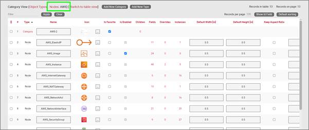
2.4.1 Category views
Category views in the netTerrain catalog act like folders where you can organize your different types for easier management. Category views can also be nested, akin to subfolders inside folders.
Category views can be accessed from any of the group options. So, for example if you click on the Nodes group from the netTerrain Catalog front page, a ‘Switch to category view’ will be displayed next to the group label, as shown below:
Switching to category view from the Node Types group
In the category view you will see your category names and any objects not assigned any category.
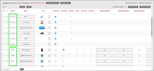
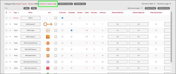
Category View
In order for a category to be listed it has to contain at least one object type.
The category columns resemble the regular table view columns, except for the children count, which provides a count of all the children objects. This also acts as a hyperlink to the list of all those children objects. Also, the ‘is favorite’ column can be used for categories to enable or disable them from the favorites sub menu in the project
Viewing the contents of a category
2.4.1.1 Bulk operations with categories
Notice that category views include checkboxes on the left side. These checkboxes let you select one or more categories or objects and perform some bulk operations from the toolbar at the top of the page. The options in the toolbar are as follows:
- Cut: The cut option would allow you to cut and paste the objects from this category to another category. Just press the cut icon and then switch to a different category table view. Then you can paste the objects into the other category. This is very useful for moving a large selection of objects that are incorrectly categorized or objects that have not been categorized at all.
- Paste: Used in conjunction with the cut option.
- Clone: Allows you to clone multiple selected objects at one time.
- Delete: Allows you to delete one or more objects at once. This will delete the object(s) from the catalog. There is no undo option for this!
To switch back to table view, simply click on the ‘Switch to table view’ option at the top.
Switching back to table view
2.5 Vendors list
The ‘Vendors’ option in netTerrain is really just a lookup table to add vendors to the list and then assign a vendor to a device, card or rack type in the catalog.
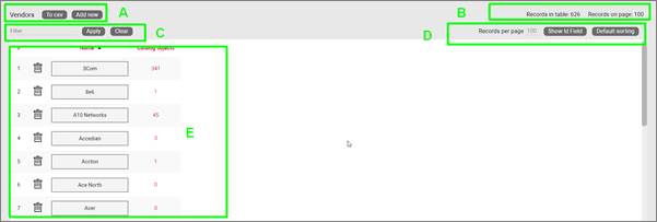
Vendors list view
Section A
- To CSV: this button will export the table’s data into a downloadable CSV file.
- Add new: clicking this button will display a form for creating a new vendor.
Section B
- Records in table: displays the total number of vendors in the table.
- Records on page: displays the total number of records on the table page that you are currently viewing.
Section C
- Filter: allows you to filter information in the current table view, similar to filters on other table views (see previous sections).
Section D
- Records per page: you can easily change the records per page value to something less than the default value. So, for instance if the default is 100 records per page and you would like to see 50, simply proceed to change the value. Note that the default value is set in the admin console and can only be changed by an administrator. You cannot exceed the maximum number of records per page that was set within the admin console. If the maximum records per page is 500 then you will not be able to set a value higher than 500.
- Show ID Field: hides or shows the ID value for the record. The ID value is the unique ID that is assigned to the record in netTerrain.
- Default sorting: if you sorted the table by a column name and would like to return the table to the default sort value press this button. The default sorting for a table view is by “Name”.
Section E
- #: the row number for the current table view. This will change depending on the filter, sort value or number of records per page. Bear in mind this # is just a reference to the order in which the record appears in the visual representation of the information on the table and has no relationship to the actual data stored in the database.
- Delete option (no label): selecting ‘Delete’ will remove the vendor from the system.
- Name: the name of the vendor that will be displayed as a vendor option.
- Catalog objects: contains the number of objects that have been assigned this vendor.
3 Node types
Generic nodes (or simply nodes) are used for a variety of purposes, such as modeling location data, logical representations of networking gear, or even a chair. They have fairly basic capabilities when compared to their cousins, the smart objects, which we will review later.
Nodes are simply modeled as objects that have an image, a set of fields, and visual overrides. Even so, you can create some amazing documentation with these modest nodes. Later we will review how to add new types in the system.
3.1 Nodes vs smart objects
A node is a very unassuming yet flexible object in netTerrain: it can represent anything from a building to transportation equipment, a data center object, location or even a chair or person. Nodes can, of course, be connected with other nodes or to a smart object. Yet nodes are rather modest compared to their cousins, the smart objects. Nodes, as opposed to smart objects are not aware of subcomponents they may contain, their physical dimensions, let alone more sophisticated properties like weight or power usage.
If you are a user of netTerrain DCIM you probably want to use smart objects in case you need to document entities like routers, switches, cards or cabinets, so that you can take advantage of some of the business rules and automation that netTerrain offers. These business rules and features include:
For devices and cards:
-
An extensive predefined library of makes and models
-
Automatic creation of subcomponents (ports and slot)
-
Automatic creation of a background image
-
Awareness of physical size and weight
-
Easy “snap in” for rack mounting
-
Awareness of power consumption
-
Ability to receive automatic alarms from the Integration Toolkit (ITK)
-
More comprehensive modeling capabilities such as reference node location
-
Ability to restrict which card types can be positioned under which slot
-
Pre-defined reports in the dashboard
For racks:
-
Awareness of rack unit occupancy
-
Automatic creation of a background image
-
Smart aggregation of dependent devices for rack occupancy, power and weight consumption
-
Pre-defined visual overrides on floor plans for rack occupancy, power and weight thresholds
-
Pre-defined reports in the dashboard
Generic nodes (or simply nodes) have none of these capabilities. They are simply modeled as objects that have an image, a set of fields, and visual overrides.
3.1.1 Can I use nodes to represent devices?
None of the features for smart devices described above prevents a user from utilizing generic nodes to represent devices. In those cases, netTerrain really doesn’t see a difference between your “nodes as devices” and any other node. You can certainly create a node type that looks like a router and later connect it to another instance of a generic node type that looks like a switch. The caveat is that netTerrain will treat these objects as any other generic node. What this means, is that if you want to document the ports of a router or switch, you will need to create them manually, and if you want to rack mount it, you will have to resize it and fit it inside a rack diagram manually.
Generic nodes must be used in place of smart devices in netTerrain Logical, since this product does not have smart devices as a feature. Otherwise, we only recommend using generic nodes in place of smart devices if you have little use for tracking things like physical rack locations, devices subcomponents, port occupancy, power and weight consumption, etc.
3.2 Managing node types
The Node Type list, field list and visual overrides list is almost identical to the object lists reviewed earlier in this guide.
Below you can explore the main sections of the Node Types view.
Node Types list view
The elements that comprise this view include:
Section A
- To CSV: this button allows you to export the table view to a downloadable CSV file.
- Add new: selecting this will display a form to create a new object.
- Import: Allows you to import a netTerrain device package.
Section B
- Records in table: displays the total number of objects in the table. For example, if this is the nodes view then this will display the total number of nodes in the catalog.
- Records on page: displays the total number of records on the table page that you are currently viewing.
Section C
Filter: allows you to filter information in the current table view. If you would only like to display the objects related to “Cisco” in their name, then type “Cisco” into the filter box and press the ‘Apply’ button. You can change the filter by simply typing in a different string and pressing the ‘Apply’ button. If you no longer need the filter, press the ‘Clear’ button to remove the filter.
Section D
- Records per page: you can change the records per page value to a value that is less than the default value. Note that the default value is set in the admin console and can only be changed by an administrator.
- Show ID Field: hides or shows the ID value for the record. The ID value is the unique ID that is assigned to each record in netTerrain.
- Default Sorting: if you sorted the table by a column name and would like to return the table to the default sort value, press this button. The default sorting for a table view is by “Name”. Changing the default sorting is temporary. The default is restored once you navigate away from the table view.
Section E
- #: the row number for the current table view. This will change depending on the filter, sort value or number of records per page. Bear in mind this # is just a reference to the order in which the record appears in the visual representation of the information on the table and has no relationship to the actual data stored in the database.
- Options (no label): the ‘Delete’ option allows you to delete an object. Note that you can only delete an object if it is not being used in netTerrain. If it is being used, you would need to remove all instances of the object before you can delete the object.
- Clone: this button, as the name says, allows you to clone the type. In essence it creates an exact replica with the type in the catalog, which you can then edit, rename, etc.
- Delete: quite self-explanatory. Careful with the deletions! This action cannot be undone. Also, you cannot delete a node type of instances of that type exist in the project.
- Group: every object type is associated with a certain internal group in netTerrain. The assigned group will be one of the following: node, rack, device, or card. Groups are fixed in netTerrain and cannot be edited, and new groups cannot be added.
- Name: the object’s name, which can be changed by editing the text field.
- Category: allows the user to assign a category to the node type.
- Default image: the image that will be displayed for any new instances of the object. If there are visual overrides, these will override the default image when the visual override is triggered (more on that later).
- Fields: this link shows the number of fields associated with the object and provides a link to access the fields table (more on this later).
- Overrides: overrides are rules associated with one or more fields for that type. Clicking on the overrides # will redirect you to a table with all assigned overrides (more on that later).
- Instances: the number of instances that are active objects in the project. Clicking the number will provide a table of these instances. Note that this table is also editable, which can provide a useful way for quickly changing instance data in table view.
- Is Favorite: when checked, this object will appear in the object’s type menu button in the project area or in the drag and drop catalog pane.

These menu buttons will be populated with a favorites list. Favorites can be added or removed at any time. They have no impact on existing objects in a diagram.
- Is Enabled: when checked, this object will be available to users in the project area as they pick an entry from the type drop down field. Objects marked as favorite cannot be disabled. You must first uncheck the favorite option before disabling it.
- Default width: the assigned width when a new instance is created. The instance’s value can be changed as needed. To change the default width value simply edit the text field. The default size of an object can also be changed when right clicking on an object in the project and choosing the ‘set default size’ option.
- Default height: The assigned height when a new instance is created. The instance’s value can be changed as needed. To change the default height value, edit the text field. The default size of an object can also be changed when right clicking on an object in the project and choosing the ‘set default size’ option.
- Keep aspect ratio: when checked, the ratio between height and width of the image will remain intact when expanding or decreasing the object’s image in the project area. This can also be changed on an individual basis for each instance within the setting window for the object (see User’s guide).
- Template: this drop-down field assigns a default diagram template (see creating diagram templates in the user guide) to the sub diagram of any new instance of that object type. So, any time this object is used in the project (i.e. an instance of it is created) its sub diagram will have this template automatically assigned.
- Audit Trail: this link will take the user to a table consisting of a history of specific user’s actions associated with the object type. Note that the audit trail can only be accessed by administrators.
3.2.1 Node fields
The ‘Fields’ link explained in section E above, opens a table with all fields associated with the node type.
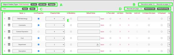
Field list view for a node type
Section A
- To CSV: this button will export the table’s data into a downloadable CSV file.
- Create new: clicking this button will display a form for creating a new field for the type. We’ll review the process of adding node fields later.
- Tagging: the tagging button opens a tagging selection dialog, allowing you to assign a set of fields to a “Tag” (a label). All existing tags appear in the settings tab for a diagram in the netTerrain project. Fields associated with a tag label can be turned on and off within a diagram. For example, you could assign a field like IP Address to a “Hide IP” tag. If you happen to be on a diagram that has objects containing that field, you could then turn on or off all IP Address fields without having to individually uncheck them from the properties window for each instance.
Section B
- Records in table: Displays the total number of fields in the table.
- Records on page: Displays the total number of records on the table page that you are currently viewing. The records per page default value can be set by the administrator within the admin console.
Section C
- Filter: allows you to filter information in the current table view. If you would only like to display the fields called IP Address, then you simply type in the search criteria into the filter box and press the ‘Apply’ button. You can change the filter by simply typing in new criteria and pressing the ‘Apply’ button. If you no longer need the filter press the ‘Clear’ button to remove the filter.
Section D
- Records per page: you can easily change the records per page value to something less than the default value. So, for instance if the default is 100 records per page and you would like to see 50, simply proceed to change the value. Note that the default value is set in the admin console and can only be changed by an administrator. You cannot exceed the maximum number of records per page that was set within the admin console. If the maximum records per page is 500 then you will not be able to set a value higher than 500.
- Show ID Field: hides or shows the ID value for the record. The ID value is the unique ID that is assigned to record in netTerrain.
- Default sorting: if you sorted the table by a column name and would like to return the table to the default sort value press this button. The default sorting for a table view is by “Name”.
Section E
- #: the row number for the current table view. This will change depending on the filter, sort value or number of records per page. Bear in mind this # is just a reference to the order in which the record appears in the visual representation of the information on the table and has no relationship to the actual data stored in the database.
- Delete: this is quite self-explanatory: pressing it will remove the field record. If the field is in use and there is data being stored within the field all this data will be lost, so be careful when using this option.
- ID: Displays the unique netTerrain system ID for the object. If you don’t see this field, simply press the Show Id Field button.
- Name: the field name that will be displayed for the associated object type.
- Is in properties: this feature is useful to control what end users can see on the properties window for a given instance of that type. For example, you can uncheck a field and prevent end users from seeing the data associated with the instances on the project.
- Is mandatory: if this option is checked it means that some data must be entered into the field when an object instance is created in the project. This is typically used in conjunction with an assigned default value to ensure some data is entered into this field. This field also cannot be deleted if the mandatory check box is enabled.
- Default value: this is the default value that will be displayed for a given field when a new instance of the object type is created. The apply button next to the field lets you apply the default value for that field to all instances of that type in the project.
- Is tree Label: determines the data value that will be displayed in the hierarchy browser. Change this if you want to see a different value displayed for an instance of this type in the hierarchy. The default is typically the name.
- List Items: list items are like drop down boxes (or combo boxes) that offer end users a finite set of values available for data entry on a given field for a given type. Click on the value to open a table with all list items associated with this field and object type.
- Overrides: click on the value to bring up a list of the overrides associated with this field and object type.
- Lock List: Allow an override list to be non-editable. If this is checked then a user cannot override the list values. They must choose a value that is already in the list.
- Is Unique (this type): Restricts all new inputs of this field for this object type to be unique across all instances.
- Is Unique (all types): Restricts all new inputs of this field for any object type to be unique across all instances.
- Is displayed: when checked, the field’s value will be displayed on the diagram for an instance of this object type. This can also be controlled on an instance basis as well as type-wide (see End User Guide).
- Justification: sets the alignment. See the settings for the field instance for more alignment options.
- Font color: the color of the text value that is displayed in the project area diagram for this field. Note that you can change the font on an instance by instance basis from the project as well (see End User Guide).
- Fill color: the background color of the text that is displayed in the project area diagram for this field. Note that you can change the fill color on an instance by instance basis from the project as well (see End User Guide).
- Font size: the size of the text that is being displayed in the project area diagram for this field. Note that you can change the font size on an instance by instance basis from the project as well (see End User Guide).
- Apply Font settings link: applies any font settings for this field to all instances of the object where the field is displayed.
3.2.2 Visual overrides and list items for nodes
When clicking on the override number for a given node type field, one can access the visual overrides list for that field, as shown below.
Visual override and list item link for node field
This list is similar in structure to the one already seen in the object overrides section earlier:
Overrides list view for node fields
Section A
- To CSV: this button will export the table’s data into a downloadable CSV file.
- Create new: clicking this button will display a form for creating a new override. We’ll review the process of creating a visual override for a node type field later.
Section B
- Records in table: displays the total number of overrides in the table.
- Records on page: displays the total number of records on the table page that you are currently viewing. The records per page default value can be set by the administrator within the admin console.
Section C
- Filter: allows you to filter information in the current table view, in the same way as the filters are used for field or object lists.
Section D
- Records per page: you can easily change the records per page value to something less than the default value. So, for instance if the default is 100 records per page and you would like to see 50, simply proceed to change the value. Note that the default value is set in the admin console and can only be changed by an administrator. You cannot exceed the maximum number of records per page that was set within the admin console. If the maximum records per page is 500 then you will not be able to set a value higher than 500.
- Show ID Field: hides or shows the ID value for the record. The ID value is the unique ID that is assigned to record in netTerrain.
- Default sorting: if you sorted the table by a column name and would like to return the table to the default sort value press this button. The default sorting for a table view is by “Name”.
Section E
- #: the row number for the current table view. this will change depending on the filter, sort value or number of records per page. Bear in mind this # is just a reference to the order in which the record appears in the visual representation of the information on the table and has no relationship to the actual data stored in the database.
- Delete option (no label): selecting ‘Delete’ will remove the override record.
- Field: the field with the list or override.
- Value: value of the list or override data. Project instances will switch to the override image when that field contains the same value displayed in the override.
- Rule: the condition that determines how a visual override is used in the project.
- Is Override: Sets the field to be an override type.
- Override: the image (or override itself) that will be used if the rule criteria is met.
- Instance effect: in addition to visual override for an object, rules can be set for additional effects that affect the object itself or the containing object (or entire ancestry) whenever the rule criteria apply. The following effects are currently available for visual overrides in netTerrain:
- No effects: this is the default, which means that no effect applies to the object instance when the rule is met.
- Blink object: the object will blink on the diagram when the override criteria is met.
- Rectangle blink: the object will display with a blinking rectangle that outlines the object.
-
Red triangle indicator: the object will display with a red triangle.
-
Parent effect: as mentioned above, effects can propagate to the affected instance’s parent object or objects. The following options are available:
-
No effects: this is the default, which means that no effect applies to the parent object of the instance that matched the rule.
- Blink object: the objects parent will blink on the diagram when the override criteria are met.
- Rectangle Blink: the objects parent will display with a blinking rectangle that outlines the object.
-
Red Triangle Indicator: the objects parent will display with a red triangle.
-
Upwards propagation: you can not only assign effects to the object’s ancestry, but you can also define (to a certain extent) how many levels you want to propagate these effects.
-
No propagation: effects are only contained within the affected instance, with propagating them upwards.
- Parent only: effects will propagate to the immediate parent.
- Parent and grandparent only: the effect will propagate to the immediate parent object and its own parent.
- Top level only: the effect will be displayed for the top-level object and the instance itself.
- All levels: all objects in the ancestry will display the effect.
3.3 Creating node types
As you start building up your netTerrain project you will probably want to create new node types that represent specific entities that are important to your project.
To add a new node, go to the catalog and look for the ‘Add New’ button next to the Nodes group. You can also click on the # value next to the ‘Nodes’. This will list all existing nodes. Then you can click the ‘Create New’ button afterwards.
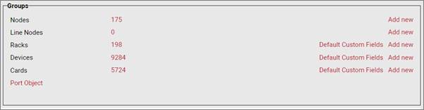
Groups section
Pressing the add button will bring up a pop-up dialog box that can be used to create a new node type in the catalog, as depicted below.
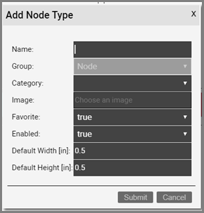
Let’s review each field:
- Name: type in the name of the new node type. This name must be unique and cannot exceed 255 characters.
- Category: Assigns the node type to a category.
- Image: this is a mandatory step when creating a node. The supported image types include PNG, JPEG, GIF, and SVG. The image that is uploaded will be the image that will be displayed when the node is used in a diagram, unless overridden by a visual override. You will also see a thumbnail of the image in certain catalog list views. The image will be uploaded and stored on the netTerrain application server.
- Favorite: set the value as true if you would like the new node to show up in the favorites list in the project. Favorites are filtered from the rest of the types on the project side when clicking on the ‘Node’ button in the insert menu or checking the ‘fav’ option in the floating catalog.
- Enabled: if you would like the node type to show up in the type drop down box list when you work with node instances then it needs to be enabled. This list is displayed when you click on an existing node that has been added to a diagram. Disabled nodes are automatically removed from the favorites list.
- Default Width: the default width of new nodes of this type when added to a diagram. Units are in inches.
- Default Height: the default height of new nodes of this type when added to a diagram. Units are in inches.
After the node has been created the node type list will be displayed, filtered by the newly created node type Id.
3.3.1 Adding a node type by dragging and dropping
There is a nice trick to add a node type into the catalog quickly: by dragging and dropping an image from a folder or browser! This must be done from the project side, from any diagram.
The best way to use this trick is to have both the netTerrain browser and the folder or website with the image side-by-side. Then, just drag and drop the desired image to the netTerrain diagram, as shown below:
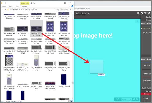
Create a node type by dragging and dropping an image
After you dropped the image on the diagram, netTerrain gives you the option to create it as a floating image, a node type, a device type, or a rack type. Choose the ‘Node’ option:
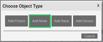
Choosing the ‘__Node__’ option to create a node type
This completes the process. It is up to you to access the catalog for that type and then add any custom properties or behaviors afterwards, but as a quick hack to add an item to the catalog this isn’t too bad!
3.3.2 Creating custom fields for nodes
Once a node type has been created, it contains three mandatory fields that exist for every instance of a node type in the project:
- Id: a 14-digit system-generated number (not visible on the field list view)
- Name: the field that will store the name of each instance
- Type: the field that stores the type of node
In addition, you may want to create additional custom fields that represent other properties of the node instances. To create a custom property for a node type, go to the node types list and follow these steps:
- Click on the hyperlink that shows the number of fields (2, when there are no custom fields)
- This will take you to the fields list for that node type. Click on the ‘Add new’ button
-
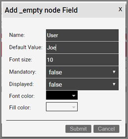
This opens the dialog for adding a new field, where you:
-
name the field
- pick a default value for your field
- pick a font size for the field, if it is displayed on the diagram
- set the field as mandatory during the data entry process
- set it as displayed, so that when it is filled out, that value shows up on the diagram (usually next to the node)
- pick a font color for the field, if it is displayed on the diagram
- pick a fill color for the field, if it is displayed on the diagram
Once the field has been added you can then edit any field parameters from the fields list, as seen already in the previous section:
- Name: the field name that will be displayed for the associated object type.
- Is in properties: this feature is useful to control what end users can see on the properties window for a given instance of that type. For example, you can uncheck a field and prevent end users from seeing the data associated with the instances on the project.
- Property order: this is self-explanatory and lets you choose the order in which the property appears in the properties window of the project when you click on an instance of that type.
- Is mandatory: if this option is checked it means that some data must be entered into the field when an object instance is created in the project. This is typically used in conjunction with an assigned default value to ensure some data is entered into this field. This field also cannot be deleted if the mandatory check box is enabled.
- Default value: this is the default value that will be displayed for a given field when a new instance of the object type is created. The apply button next to the field lets you apply the default value for that field to all instances of that type in the project.
- Is tree Label: determines the data value that will be displayed in the hierarchy browser. Change this if you want to see a different value displayed for an instance of this type in the hierarchy. The default is typically the name.
- List Items: list items are like drop down boxes (or combo boxes) that offer end users a finite set of values available for data entry on a given field for a given type. Click on the value to open a table with all list items associated with this field and object type.
- Overrides: click on the value to bring up a list of the overrides associated with this field and object type.
- Lock List: Allow an override list to be non-editable. If this is checked then a user cannot override the list values. They must choose a value that is already in the list.
- Is Unique (this type): Restricts all new inputs of this field for this object type to be unique across all instances.
- Is Unique (all types): Restricts all new inputs of this field for any object type to be unique across all instances.
- Is displayed: when checked, the field’s value will be displayed on the diagram for an instance of this object type. This can also be controlled on an instance basis as well as type-wide (see End User Guide).
- Justification: sets the alignment. See the settings for the field instance for more alignment options.
- Font color: the color of the text value that is displayed in the project area diagram for this field. Note that you can change the font on an instance by instance basis from the project as well (see End User Guide).
- Fill color: the background color of the text that is displayed in the project area diagram for this field. Note that you can change the fill color on an instance by instance basis from the project as well (see End User Guide).
- Font size: the size of the text that is being displayed in the project area diagram for this field. Note that you can change the font size on an instance by instance basis from the project as well (see End User Guide).
- Apply Font settings link: applies any font settings for this field to all instances of the object where the field is displayed.
New custom field for a node type
3.3.2.1 Deleting a custom field
Deleting a custom field is easy: go to the fields list view for the node type and simply press the delete button on the left of the field you want to remove.
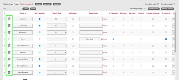
Deleting a custom field
Notice that the delete button is not enabled for the Name and Type system fields.
Attention!
As you might expect, all the values for the field corresponding to instances of that type in the project will be deleted. As such, be careful with this operation, since it cannot be undone.
3.3.3 Creating list items and visual overrides for a node field
As we saw before, when clicking on the override number for a given node type field, one can access the list items and visual overrides list, as shown below.
Visual override and list item link for a node field
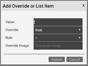
To create a new list item or visual override for a node type field, go to the fields list and follow these steps:
- Click on the hyperlink that shows the number of overrides (obviously 0 when there are none)
- This will take you to the overrides list for that node type. Click on the ‘Add new’ button
-
This opens the dialog for adding a new override, where you:
-
provide the value that will trigger the override (in the case of a simple list item this is just the list item value)
- specify whether this is an override or not (if you choose false then this completes the process for adding a list item)
- choose the rule that will trigger the override (equal to, contains, greater than, less than)
- set the override image
Once the override has been added you can then edit any parameters from the overrides list, as seen in the previous chapter:
- Value
- Rule
- Is Override
- Override
- Instance effect
- Parent effect
- Upwards propagation
3.3.3.1 Deleting an override or list item
To delete an override or list item for a node field go to the overrides list view for the node type and field and simply press the delete button on the left of the entry you want to remove.
Deleting an override for a field
4 Link types
Links in netTerrain are what the name implies: connections between nodes. netTerrain supports both direct and inter diagram links and automatically creates reference nodes as needed. Links can be created between any combination of two node objects of the following classes:
- Nodes
- Devices
- Ports
- Racks
So, it is valid to create a link between, say, a node and a port, or a rack and a device. It is also valid to create more than one link against a single object. As such, a node can serve as a termination point for multiple links. However, it is not valid to create a link between anything other than two objects. A link must always have two and only two endpoints. As opposed to other applications like netViz or Visio, netTerrain does not allow dangling links.
4.1 Managing link types
netTerrain’s flexible list of link features is managed from the link types section in the catalog dashboard, as displayed below.
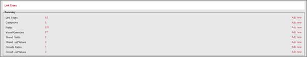
Link Types section
The following shortcuts are available from the link types section:
Summary
- Link Types: the # of link types within the netTerrain catalog.
- Categories: shortcut to create link categories.
- Fields: the # of fields associated with the link types in the netTerrain catalog.
- Visual overrides: the number of visual overrides that have been assigned to fields for links within the netTerrain catalog.
- Strand Fields: shortcut to open the list of custom fields configured for strands
- Circuit Fields: shortcut to open the list of custom fields configured for circuits
The ‘Add New’ buttons on the right provide a quick way to create link types, fields or overrides.
4.1.1 Link types view
Just as with node types, this view provides a list of all the link types created in the catalog.
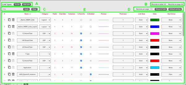
Link types list view
Let’s review each part of this section:
Section A
- To CSV: this button allows you to export the table view to a downloadable CSV file.
- Add New: selecting this will display a form to create a new object.
Section B
- Records in table: displays the total number of objects in the table.
- Records on page: displays the total number of records on the table page that you are currently viewing.
Section C
- Filter: allows you to filter information in the current table view. If you would only like to display the objects related to “Cisco” in their name, then type “Cisco” into the filter box and press the ‘Apply’ button. You can change the filter by simply typing in new criteria and pressing the ‘Apply’ button. If you no longer need the filter press the ‘Clear’ button to remove the filter.
Section D
- Records per page: you can change the records per page value to a value that is less than the default value. So, if the default is 100 records per page and you would like to see 50 then change the value. Note that the default value is set in the admin console and can only be changed by an administrator.
- Show ID Field: hides or shows the ID value for the record. The ID value is the unique ID that is assigned to record in netTerrain.
- Default Sorting: if you sorted the table by a column name and would like to return the table to the default sort value press this button. The default sorting for a table view is by “Name”. Changing the default sorting is temporary. The default is restored once you navigate away from the table view.
Section E
- #: the row number for the current table view. This will change depending on the filter, sort value or number of records per page. Bear in mind this # is just a reference to the order in which the record appears in the visual representation of the information on the table and has no relationship to the actual data stored in the database.
- Options (no label):
- Delete: the ‘Delete’ option allows you to delete a link. Note that you can only delete an object if it is not being used in netTerrain. If it is being used, you would need to remove all instances of the object before you can delete it.
- Clone: this button, as the name says, allows you to clone the type. It creates an exact replica with the type in the catalog, which you can then edit, rename, etc.
- ID: Unique netTerrain identifier for the object. This property can be hidden.
- Name: the object’s name, which can be changed by editing the text field.
- Category: allows the user to assign a category to a link type.
- Fields: this link shows the number of fields associated with the object and provides a link to access the fields table (more on this later).
- Overrides: overrides are rules associated with one or more fields for that type. Clicking on the overrides # will redirect you to a table with all assigned overrides (more on that later).
- Instances: the number of instances that are active objects in the project. Clicking the number will provide a table of these instances. Note that this table is also editable, which can provide a useful way for quickly changing instance data in table view.
- Is Favorite: when checked, this object will appear in the object’s type menu button in the project area. These menu buttons will be populated with a favorites list. Favorites can be added or removed at any time. They have no impact on existing objects in a diagram.
- Is Enabled: when checked, this object will be available to users in the project area as they pick an entry from the type drop down field. Objects marked as favorite cannot be disabled. You must first uncheck the favorite option before disabling it.
- Preview: this is a visual indicator for the link type in its default configuration (prior to any possible visual overrides being applied).
- Thickness: the default thickness for a given link type. You can use visual overrides to allow the link thickness to be determined by the value of a field.
- Link Style: this is the appearance of a link, which can be solid, dashed, dash-dot, dash-dot-dot, or dotted by default. Link styles can also be changed on a per instance basis using visual overrides.
- Color: the default color for a given link type. This can be changed within the diagram by using a visual override. Link colors can also be changed on a per instance basis using visual overrides.
- Start Arrow: Allows the user to select an arrow head style for the start of the arrow. Any style selection can be reviewed in the preview window.
- End Arrow: Allows the user to select an arrow head style for the end of the arrow. Any selection can be viewed in the preview window.
- Snapped to edge: Sets the link to automatically snap the end points to the edge of the object.
-
Restrictions: displays the number of restrictions associated with this link type. Restrictions are a set of business rules associated with link types but note that they cannot be created for links that already have been used in the project (otherwise the business rule may be broken). All restrictions should be setup before using the link type. The following restrictions can be applied to link types:
-
Prevented: allows you to specify node types that the current link type cannot use as endpoints.
-
Enforced: this is the opposite of the above, which means that users are forced to use any of the listed node types as endpoints when connecting them with the current link type. You can specify more than one object type to enforce. For example, you may want to only allow a link called “Carrier” to be connected to your buildings.
-
Matching Port Connectors: Enforces end points to have matching connector values.
- Strands (only available for licensed OSP installations): this column lets a power user configure a predetermined number of strands for the link type. When an instance of this type is created in the project, ‘n’ number of strands will also be created for that instance.
- Mode (only available for licensed OSP installations): this column lets you specify the mode of the link, if it will be used as a cable containing strands. Modes allow users to restrict and prevent hybrid configurations of circuits during the Automatic Circuit Routing Algorithm (ACRA) process.
- Use for ACRA Patch (only available for licensed OSP installations): when this value is checked for a link type, it becomes available as a type that can be used during the patching process of a circuit. Please see the end user guide to learn more about the creation of circuits.
- Excludable from ACRA (only available for licensed OSP installations): when this value is checked, instances of that link type are excluded from any ACRA calculations.
- Audit Trail: this link will take the user to a table consisting of a history of specific user’s actions associated with the object type. Note that the audit trail can only be accessed by administrators.
4.1.2 Link fields
Again, just like with node types, there is a list for all the fields associated with a given link type. Below we will review the elements comprising this list view.
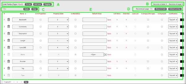
Link Fields list view
Section A
- To CSV: this button will export the table’s data into a downloadable CSV file.
- Add new: clicking this button will display a form for creating a new field.
- Tagging: the tagging button opens a tagging selection dialog, allowing you to assign a set of fields to a “Tag” (a label). All existing tags appear in the settings tab for a diagram in the netTerrain project. Fields associated with a tag label can be turned on and off within a diagram. So, you could assign a field like IP Address to a “Hide IP” tag. If you happen to be on a diagram that has links containing that field, you could then turn on or off all IP Address fields without having to individually uncheck them from the properties window for each instance.
Section B
- Records in table: Displays the total number of fields in the table.
- Records on page: Displays the total number of records on the table page that you are currently viewing. The records per page default value can be set by the administrator within the admin console.
Section C
- Filter: allows you to filter information in the current table view. If you would only like to display the fields called IP Address, then you simply type in the search criteria into the filter box and press the ‘Apply’ button. You can change the filter by simply typing in new criteria and pressing the ‘Apply’ button. If you no longer need the filter press the ‘Clear’ button to remove the filter.
Section D
- Records per page: you can easily change the records per page value to something less than the default value. So, for instance if the default is 100 records per page and you would like to see 50, simply proceed to change the value. Note that the default value is set in the admin console and can only be changed by an administrator. You cannot exceed the maximum number of records per page that was set within the admin console. If the maximum records per page is 500 then you will not be able to set a value higher than 500.
- Show ID Field: hides or shows the ID value for the record. The ID value is the unique ID that is assigned to record in netTerrain.
- Default sorting: if you sorted the table by a column name and would like to return the table to the default sort value press this button. The default sorting for a table view is by “Name”.
Section E
- #: the row number for the current table view. This will change depending on the filter, sort value or number of records per page. Bear in mind this # is just a reference to the order in which the record appears in the visual representation of the information on the table and has no relationship to the actual data stored in the database.
- Delete: as the label implied, clicking on this link will remove the field record for the given type. If the field is in use and there is data being stored within the field all this data will be lost so be careful when using this option.
- Name: the field name that will be displayed for the associated link type.
- Is in properties: this feature is useful to control what end users can see on the properties window for a given instance of that type. For example, you can uncheck a field and prevent end users from seeing the data associated with the instances on the project.
- Property Order: this option lets you control the order in which properties appear in the properties window when you are selecting the object in the project.
- Is mandatory: if this option is checked it means that some data must be entered into the field when an object instance is created in the project. This is typically used in conjunction with an assigned default value to ensure some data is entered into this field. This field also cannot be deleted if the mandatory check box is enabled.
- Default value: this is the default value that will be displayed for a given field when a new instance of the object type is created. The apply button next to the field lets you apply the default value for that field to all instances of that type in the project.
- List Items: list items are like drop down boxes (or combo boxes) that offer end users a finite set of values available for data entry on a given field for a given type. Click on the value to open a table with all list items associated with this field and object type.
- Overrides: click on the value to bring up a list of the overrides associated with this field and object type.
- Lock List: Sets the list as non-editable. Users must choose from the list of values and cannot override the list with a different value.
- Is Unique (this type): Restricts all new inputs of this field for this object type to be unique across all instances.
- Is Unique (all types): Restricts all new inputs of this field for any object type to be unique across all instances.
- Is displayed: when checked, the field’s value will be displayed on the diagram for an instance of this link type. This can also be controlled on an instance basis as well as type-wide (see End User Guide).
- Justification: sets the alignment. See the settings for the field instance for more alignment options.
- Font color: the color of the text value that is displayed in the project area diagram for this field. Note that you can change the font on an instance by instance basis from the project as well (see End User Guide).
- Fill color: the background color of the text that is displayed in the project area diagram for this field. Note that you can change the fill color on an instance by instance basis from the project as well (see End User Guide).
- Font size: the size of the text that is being displayed in the project area diagram for this field. Note that you can change the font size on an instance by instance basis from the project as well (see End User Guide).
- Apply Font settings link: applies any font settings for this field to all instances of the object where the field is displayed.
In the case of the system required ‘Name’ field for links, there is a special drop down for the ‘Default Value’ which allows for specifying a naming convention for new link instances:
- Node A – Node B
- Parent :: Node A – Parent :: Node B
- Parent :: Parent :: Node A – Parent :: Parent:: Node B
- Link Type :: Link Id
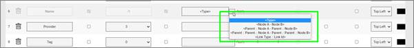
Naming convention options for Name field
4.1.3 Visual overrides for links
Visual Overrides for links work in a similar way as for nodes: they specify a set of ‘business rules’ that change the appearance of a link when a specified attribute matches a certain value.
For example, a Power User may set up an override for a field called ‘status’ for a link type called ‘Circuit, such that when the value for status is equal to ‘alarmed’ then the circuit color, for example, changes to red. Overrides for links can change the thickness, color and style of individual link instances in the project.
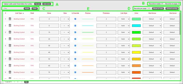
Link visual overrides list view
Below we will review the elements comprising the overrides list view:
Section A
- To CSV: this button will export the table’s data into a downloadable CSV file.
- Add new: clicking this button will display a form for creating a new override.
Section B
- Records in table: displays the total number of overrides in the table.
- Records on page: displays the total number of records on the table page that you are currently viewing. The records per page default value can be set by the administrator within the admin console.
Section C
- Filter: allows you to filter information in the current table view, in the same way as the filters are used for field or object lists.
Section D
- Records per page: you can easily change the records per page value to something less than the default value. So, for instance if the default is 100 records per page and you would like to see 50, simply proceed to change the value. Note that the default value is set in the admin console and can only be changed by an administrator. You cannot exceed the maximum number of records per page that was set within the admin console. If the maximum records per page is 500 then you will not be able to set a value higher than 500.
- Show ID Field: hides or shows the ID value for the record. The ID value is the unique ID that is assigned to record in netTerrain.
- Default sorting: If you sorted the table by a column name and would like to return the table to the default sort value press this button. The default sorting for a table view is by “Name”.
Section E
- #: the row number for the current table view. This will change depending on the filter, sort value or number of records per page. Bear in mind this # is just a reference to the order in which the record appears in the visual representation of the information on the table and has no relationship to the actual data stored in the database.
- Delete (no title): selecting Delete will remove the override record.
- Link Type: the object with the field that is assigned the override.
- Field: the field with the list or override.
- Value: value of the list or override data. Link instances will switch to the override color, thickness or style when that field contains the same value displayed in the override.
- Rule: the condition that determines how a visual override is used in the project.
- Is Override: Sets the field to allow for a visual override condition.
- Preview: shows a view of the link with assigned color, thickness and style.
- Thickness: assigned line thickness for the link.
- Link style: assigned link style for the type. Options include solid, dashed, dash-dot, dash-dot-dot, or dotted.
- Color: assigned color for the link type.
- Start Arrow: Allows the user to select an arrow head style for the start of the arrow. Any style selection can be reviewed in the preview window.
- End Arrow: Allows the user to select an arrow head style for the end of the arrow. Any selection can be viewed in the preview window.
4.2 Creating link types
Same as with the node types, as you start building up your netTerrain project you will probably want to create new link types that represent specific connection entities that are important to your project.
To add a new link, go to the catalog and look for the ‘Add New’ button next to the ‘Link Types’ group. You can also click on the # value next to the ‘Links’. This will list all existing link types and from there you can click on the ‘Add New’ button and proceed.
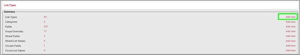
Adding a new link type
Pressing the add button will bring up a pop-up dialog box that can be used to create a new link type in the catalog, as depicted below.
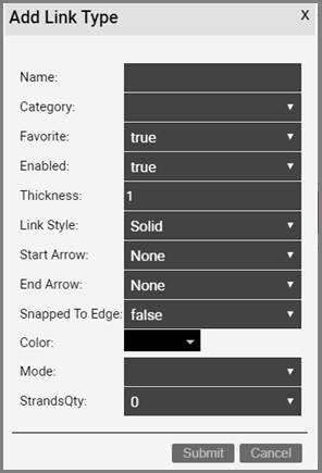
Link type list view with add link type dialog box
Let’s review each field:
- Name: type in the name of the new link type. This name must be unique and cannot exceed 255 characters.
- Category: assigns the node type to a category.
- Favorite: set the value as true if you would like the new node to show up in the favorites list in the project. Favorites are filtered from the rest of the types on the project side when clicking on the ‘Link’ button in the insert menu or checking the ‘fav’ option in the floating catalog.
- Thickness: the default thickness for a given link type. You can use visual overrides to allow the link thickness to be determined by the value of a field.
- Link Style: this is the appearance of a link, which can be solid, dashed, dash-dot, dash-dot-dot, or dotted by default. Link styles can also be changed on a per instance basis using visual overrides.
- Start Arrow: allows the user to select an arrow head style for the start of the arrow. Any style selection can be reviewed in the preview window.
- End Arrow: allows the user to select an arrow head style for the end of the arrow. Any selection can be viewed in the preview window.
- Snapped to Edge: sets the link to automatically snap the end points to the edge of the object.
- Color: the default color for a given link type. This can be changed within the diagram by using a visual override. Link colors can also be changed on a per instance basis using visual overrides.
After the link has been created the link type list will be displayed, filtered by the newly created link type Id.
4.2.1 Creating custom fields for links
Once a link type has been created, it contains three mandatory fields that exist for every instance of a link type in the project:
- Id: a 14-digit system-generated number (not visible on the field list view)
- Name: the field that will store the name of each instance
- Type: the field that stores the type of link
In addition, you may want to create additional custom fields that represent other properties of the link instances. To create a custom property for a link type, go to the link types list and follow these steps:
- Click on the hyperlink that shows the number of fields (2, when there are no custom fields)
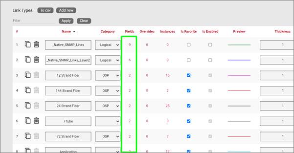
- This will take you to the fields list for that link type. Click on the ‘Add new’ button
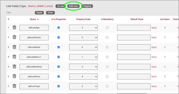
-
This opens the dialog for adding a new field, where you:
-
name the field
- pick a default value for your field
- pick a font size for the field, if it is displayed on the diagram
- set the field as mandatory during the data entry process
- set it as displayed, so that when it is filled out, that value shows up on the diagram (usually next to the link)
- pick a font color for the field, if it is displayed on the diagram
- pick a fill color for the field, if it is displayed on the diagram
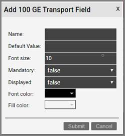
Once the field has been added you can then edit any field parameters from the fields list, as seen already in the previous section:
- Name: the field name that will be displayed for the associated link type.
- Is in properties: this feature is useful to control what end users can see on the properties window for a given instance of that type. For example, you can uncheck a field and prevent end users from seeing the data associated with the instances on the project.
- Property Order: this option lets you control the order in which properties appear in the properties window when you are selecting the object in the project.
- Is mandatory: if this option is checked it means that some data must be entered into the field when an object instance is created in the project. This is typically used in conjunction with an assigned default value to ensure some data is entered into this field. This field also cannot be deleted if the mandatory check box is enabled.
- Default value: this is the default value that will be displayed for a given field when a new instance of the object type is created. The apply button next to the field lets you apply the default value for that field to all instances of that type in the project.
- List Items: list items are like drop down boxes (or combo boxes) that offer end users a finite set of values available for data entry on a given field for a given type. Click on the value to open a table with all list items associated with this field and object type.
- Overrides: click on the value to bring up a list of the overrides associated with this field and object type.
- Lock List: Sets the list as non-editable. Users must choose from the list of values and cannot override the list with a different value.
- Is Unique (this type): Restricts all new inputs of this field for this object type to be unique across all instances.
- Is Unique (all types): Restricts all new inputs of this field for any object type to be unique across all instances.
- Is displayed: when checked, the field’s value will be displayed on the diagram for an instance of this link type. This can also be controlled on an instance basis as well as type-wide (see End User Guide).
- Justification: sets the alignment. See the settings for the field instance for more alignment options.
- Font color: the color of the text value that is displayed in the project area diagram for this field. Note that you can change the font on an instance by instance basis from the project as well (see End User Guide).
- Fill color: the background color of the text that is displayed in the project area diagram for this field. Note that you can change the fill color on an instance by instance basis from the project as well (see End User Guide).
- Font size: the size of the text that is being displayed in the project area diagram for this field. Note that you can change the font size on an instance by instance basis from the project as well (see End User Guide).
- Apply Font settings link: applies any font settings for this field to all instances of the object where the field is displayed.
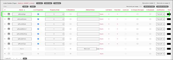
Custom field for a link type
4.2.1.1 Deleting a custom field
Deleting a custom field is easy: go to the fields list view for the link type and simply press the delete button on the left of the field you want to remove.
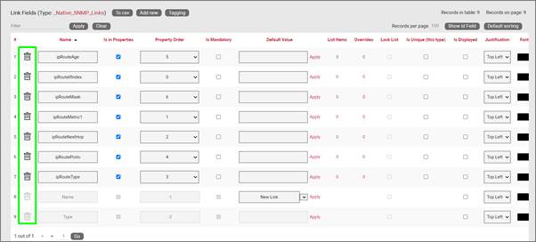
Deleting a custom field
Notice that the delete button is not enabled for the Name and Type system fields.
Attention!
As you might expect, all the values for the field corresponding to instances of that type in the project will be deleted. As such, be careful with this operation, since it cannot be undone.
4.2.2 Creating list items and visual overrides for a link field
As we saw before, when clicking on the override number for a given link type field, one can access the list items and visual overrides list, as shown below.
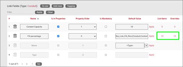
Visual override and list item link for a link field
To create a new list item or visual override for a link type field, go to the fields list and follow these steps:
- Click on the hyperlink that shows the number of overrides (obviously 0 when there are none)
- This will take you to the overrides list for that link type. Click on the ‘Add new’ button
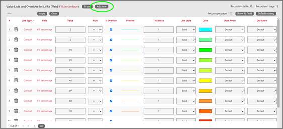
-
This opens the dialog for adding a new override. This dialog contains more options than the visual overrides for nodes:
-
provide the value that will trigger the override (in the case of a simple list item this is just the list item value)
- specify whether this is an override or not (if you choose false then this completes the process for adding a list item)
- choose the rule that will trigger the override (equal to, contains, greater than, less than)
- set the link thickness, style, arrow terminations and color
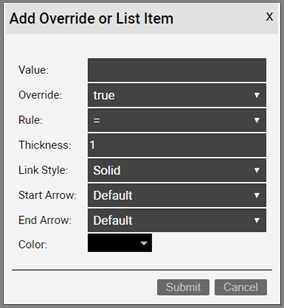
Once the override has been added you can then edit any parameters from the overrides list, as seen in the previous chapter:
- Value
- Rule
- Is Override
- Preview
- Thickness
- Link style
- Color
- Start Arrow
- End Arrow
4.2.2.1 Deleting an override or list item
To delete an override or list item for a link field go to the overrides list view for the link type and field and simply press the delete button on the left of the entry you want to remove.
4.3 Cables and strands
Fiber strands are thin glass optical lines bundled inside a bigger fiber cable. They transmit information by means of light signals with certain wavelengths. As shown later in the guide, when a user creates a cable with a strand count greater than 0, strands are created automatically when an end-user creates an instance of such a cable in the project.
In the context of netTerrain, a cable is a link that contains strands. As soon as you define a strand count greater than zero for a link type, we like to refer to that link as a cable. Cables usually exist in Outside Plant (OSP) projects since these require de management of strands. We’ll talk about strands in the next section.
Cables sometimes have a mode assigned (see Link Types View section), so that all its derived strands can inherit that mode. Once strands have been defined for that cable, any instances of that type will automatically have those strands created in the project.
To view the list of strands for a cable type, click on the strand count hyperlink under the strands column:
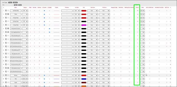
This will open a new table view containing all the strands for that cable:

Let us review the different UI elements of this view:
A) Next to the standard buttons you have already seen in other views for csv export and adding new instances, you’ll find a particular button to add ‘TIA strands’. This is a button that creates a set of 12 strands using the standardized TIA standard color code.
B) The delete button, of course, deletes a strand from the cable type and the apply button applies any changes to all instances of the given strand
C) The strand and buffer color definitions used here will be reflected in the project for ports that connect a strand and in strand lists. Users can modify the colors of strands and buffers but by default the colors will reflect the TIA standard where the buffer colors will also follow the strand color sequence for every 12 strands. The mode drop-down box lets users define the default mode for that strand, usually to prevent hybrid modes on a circuit path.
D) The property values hyperlink opens the Predefined Strand Properties Values list where users can change the default value for a custom property for that particular strand.
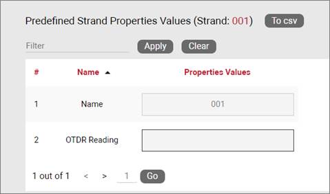
4.3.1 Strand colors
For high strand counts or cables with bundles (or buffers) of 12 strands it is common to identify each strand with a color code standard adopted from the early TIA telephone standards for copper wire, as shown in the table below.
| Fiber Number | Color |
|---|---|
| 1 | Blue |
| 2 | Orange |
| 3 | Green |
| 4 | Brown |
| 5 | Slate |
| 6 | White |
| 7 | Red |
| 8 | Black |
| 9 | Yellow |
| 10 | Violet |
| 11 | Rose |
| 12 | Aqua |
The netTerrain catalog supports the TIA standard for the creation of strands in cables by automatically creating sets of 12 strands with the color code shown above. These colors can be overwritten on a strand-by-strand basis.
4.3.2 Strand fields
Just like with ports, there are no strand types in the catalog, however, a power-user can create custom fields for those strands. To do this, follow these steps:
1) First, click on the Strand Fields hyperlink located in the summary section of the catalog dashboard:
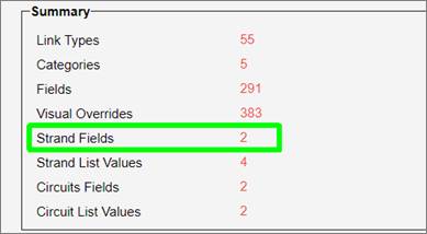
2) Then from the Strand Properties list view click on ‘Add New’ to add a new custom property. This property will appear for all strands in the project and will be visible from the strand list (see End-user guide).
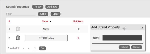
Adding a custom strand property
Just like with node and link properties, any strand property other than the name can be configured as a list box. Once an item (or value) has been included in the list for a given property, that property will be displayed as a list box in the project. To add values to a list box property simply click on the hyperlink number under the List Items header next to the property. This will take you to the ‘Strand list values’ view, from where you can add a new value by clicking on the ‘Add New’ button:
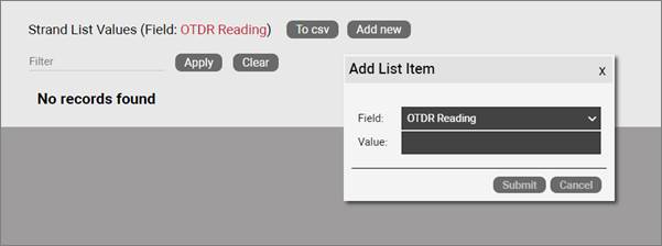
Adding a new value to a List Box property
4.4 Circuits
In an OSP project a circuit can be many things: a service between two points A and Z on a map, an MPLS connection going over fiber or really any logical relationship between points that uses physical resources of the network. One thing is quite consistent in fiber plant layouts though: circuits traverse from A to Z over strands that are inside cables (probably in some conduit) through several hops. And there can be thousands of them.
In past versions of netTerrain users created circuits as simple links between two nodes. This is possible to do in OSP projects as well, but not very practical. Traditional netTerrain links are not always well suited for this type of behavior. Therefore, in version 8 we have created a specific entity called circuits, perfectly optimized for fiber plant projects.
Some of the advantages of using this type of entity to represent your OSP circuits over a traditional link are the following:
- Easy mapping of circuit to strand without having to individually bundle each hop
- Smart algorithm to find the optimal path between two endpoints
- Automatic patching of circuits along its path
- Automatic reservation of resources
- Convenient menu options to create a diverse and redundant circuit from an existing one
- Dedicated circuit views and searches
- Better performance
4.4.1 Circuit fields
Just like with strands, there are no circuit types in the catalog, however, a power-user can create custom fields for those circuits. To do this, follow these steps:
1) First, click on the Circuit Fields hyperlink located in the summary section of the catalog dashboard:
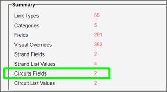
2) From the Circuit Properties list view click on ‘Add New’ to add a new custom property. This property will appear for all circuits in the project and will be visible from the circuit list views. Here you can also control if a custom property appears in the creation process using the Automated Circuit Routing Algorithm (ACRA). If you want to keep a custom field out of the ACRA process, just uncheck the ‘Show in ACRA’ checkbox. For more information on the ACRA please see the End-user guide.
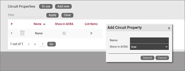
Adding a custom circuit property
5 Smart objects
In previous chapters, we learned how to work with nods and links, which can be used for a variety of purposes. In this chapter, we focus on the more sophisticated part of netTerrain: the creation and modeling of “smart objects” typically used in Data Center Infrastructure Management projects (DCIM).
Previously we saw a brief overview of smart objects and if you are a user of netTerrain DCIM you probably want to use them to document things like routers, switches, cards or cabinets, so that you can take advantage of some of the business rules and automation that netTerrain offers. Let’s review them here again:
For devices and cards:
-
An extensive predefined library of makes and models
-
Automatic creation of subcomponents (ports and slot)
-
Automatic creation of a background image
-
Awareness of physical size and weight
-
Easy “snap in” for rack mounting
-
Awareness of power consumption
-
Ability to receive automatic alarms from the Integration Toolkit (ITK)
-
More comprehensive modeling capabilities such as reference node location
-
Ability to restrict which card types can be positioned under which slot
-
Pre-defined reports in the dashboard
For racks:
-
Awareness of rack unit occupancy
-
Automatic creation of a background image
-
Smart aggregation of dependent devices for rack occupancy, power and weight consumption
-
Pre-defined visual overrides on floor plans for rack occupancy, power and weight thresholds
-
Pre-defined reports in the dashboard
Generic nodes (or simply nodes) have none of these capabilities. They are simply modeled as objects that have an image, a set of fields, and visual overrides.
5.1 Racks
A Rack is a “container” for smart devices. Other objects can also be placed inside the rack diagram, but without the smart rack mounting (snapping) feature and the tracking and aggregation of power, weight and rack occupancy statistics.
Note that racks can only be created and modeled in netTerrain DCIM.
5.1.1 Creating a rack type
You can create a new rack type in a few different ways:
- Import a Json or Zip device package
- Create the rack manually step-by-step from the catalog
- Drag and drop an image from a browser or folder and follow the rest of the process manually
In this section we will go over the import and manual creation process and later we will review the detailed manual rack modeling process.
5.1.1.1 Creating a rack from a Json or Zip package
One of the beauties of maintenance is that Graphical Networks can model device, card and rack types for you. To do so, simply enter a ticket in your support portal with basic information about make and model and we will model the rack with its backplane image, size and more. We will then deliver a Zip or Json file to you, which you can then import into your catalog.
To import the file into the catalog simply go to the catalog Rack section, click on ‘Import Zip’ or ‘Import Json’ at the top, browse for your file and voila!
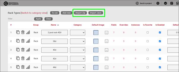
5.1.1.2 Creating a rack manually
To add a new rack type, go to the catalog and look for the ‘Add New’ button next to the racks group. You can also click on the # value next to the “Racks”. This will list all existing Racks. Then you can click on the ‘Create New’ button.
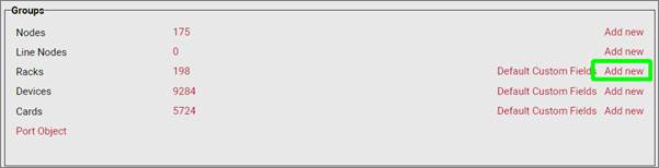
Pressing the add button will bring up a pop-up dialog box that can be used to create a new rack type in the catalog.
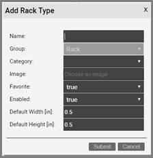
Adding a new rack type
Let’s review each field:
- Name: type in the name of the new node type. This name must be unique and cannot exceed 255 characters.
- Category: assigns the rack to a specific category..
- Image: this is a mandatory step when creating a rack. The supported image types include PNG, JPEG, GIF, and SVG. The image that is uploaded will be the image that will be displayed when the rack is used in a diagram, unless overridden by a visual override. You will also see a thumbnail of the image in certain catalog list views. The image will be uploaded and stored on the netTerrain application server. Remember, this is not the rack front or back view image you need here, this is merely the overhead image you want displayed on a floor plan, so we recommend using a simple square.
- Favorite: set the value as true if you would like the new rack type to show up in the favorites list in the project. Favorites are filtered from the rest of the types on the project side when clicking on the ‘Rack’ button in the insert menu or checking the ‘fav’ option in the floating catalog.
- Enabled: if you would like the rack type to show up in the type drop down box list when you work with rack instances then it needs to be enabled. This list is displayed when you click on an existing rack that has been added to a diagram. Disabled racks are automatically removed from the favorites list.
- Default Width: the default width of new racks of this type when added to a diagram. Units are in inches.
- Default Height: the default height of new racks of this type when added to a diagram. Units are in inches.
Important to note is that the previous sizes refer to the image of the rack node, not the physical dimensions assigned to the container sub diagram. The physical sizes are defined later in this section.
Once the rack has been added to the catalog, netTerrain shows the new type in the rack list view, as depicted below:
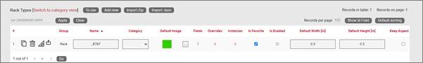
New rack type displayed in the rack list view
Just like we did with regular nodes, you can add custom fields, define visual overrides, assign the type to a category and so on. You can refer to the generic node type section to review each one of these operations.
5.1.1.3 Limiting inventory with the ‘In stock’ option
If you would like to use netTerrain for inventory control, the ‘In Stock’ option lets you limit the number of instances of a given rack type that can be added in the project.
This field is optional and if a rack type has a set ‘In stock’ value, then any user trying to import or drag and drop a rack of that type into the project, can only do so as long as the number of instances does not exceed said value.
To remove any existing inventory limits, simply blank out the field.
5.1.1.4 Default custom fields for racks
In many projects that utilize a variety of rack types, there may be a set of common fields that apply to any type. To save yourself the effort of having to create these fields every time, for every new rack type you add in the catalog, you can predefine the default custom fields that netTerrain should create automatically after adding a new rack type.
These default custom fields for racks can be managed from the catalog dashboard:
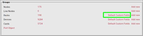
Defining default custom fields for racks
After clicking on the ‘Default Custom Fields’ link you are taken to a list view where you can manage these default custom fields, as shown below:
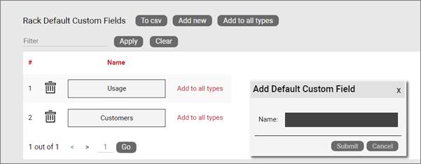
Rack type default custom fields management
Notice that when you add a new default custom field to the list, the field will be added to any new types created but will not modify the structure of custom fields for existing types. You can, however, apply the defined default custom fields to all existing types by pressing on the ‘Add to all types’ button.

Applying default custom fields to all types
5.1.2 Rack modeling process
The rack modeling process allows you to create containers inside racks, which can then be used for rack mounting devices. Containers are placeholders for devices, and they are aware of their width and height. Proper sizing of containers will then allow netTerrain to nicely snap devices inside these placeholders and compute rack unit occupancy rates.
In addition to creating containers, the rack modeling process allows you to specify properties for the rack.
After the initial creation of the rack, you can proceed with the modeling. If you are still in the list view for the rack you created, you should see a ‘Modeler’ button . If you are not in the rack list view, go to the ‘Catalog’ and click on the rack group # count.
To get started with the modeling process, first fill in the rack properties.
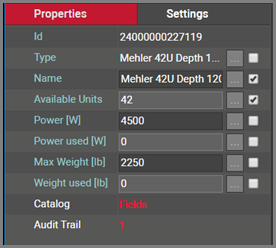
Rack properties in modeler
These properties include:
- Power: maximum power that this rack type would typically supply for devices that will be rack mounted on it. This is not a mandatory field and can be modified on a per rack instance basis. As such, we could say that this value represents the default peak power supported by this rack type. Note that if the maximum power is exceeded, this will not prevent users from mounting more devices on the rack.
- Max Weight: this is the maximum weight of all rack mounted devices that this rack can handle. This is not a mandatory field and can be modified on a per rack instance basis. Note that if the maximum weight is exceeded, this will not prevent users from mounting more devices on the rack.
- Description: non-mandatory field used as a short description for this rack type
- Vendor: this field is a non-mandatory lookup value from the vendors table. If the vendor is not in the list it will need to be added before proceeding (see previous chapter).
- Display Rack Lines: allows the Rack Unit lines to be turned on or off.
- Coupled Front/Back mounting: this checkbox enables dual views for devices mounted on one side (more on this later).
- Container children: this represents the number of containers used for this rack type. Typically, there are just one or two containers used for a rack. Later, we will review the modeling process for racks and how we can use containers.
- Instances: the number of occurrences of this rack type in the project. Naturally, this value is zero if you are modeling this rack type for the first time.
Once the properties have been entered for the rack you can proceed with the actual modeling sequence. First, you need to create a background image that will serve as a guide for placing container objects on top of it. Ideally, the rack image should display rack units on the side that can serve as a reference for users rack mounting devices. To add the background image, click on the  icon in the Page menu. You will then be able to browse for an image on your local drive. Valid image formats include raster images with PNG, JPEG and GIF extensions and the SVG vector format image type.
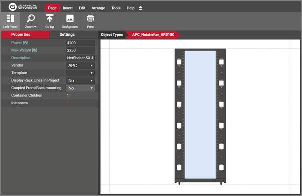
Rack modeling process for a front image view of a cabinet
The example image above shows a single sided cabinet view, ready to be modeled with one container object. An appropriate container would probably laid out exactly on top of the rack mountable area overlayed on top of the cabinet front view. To create the container press the container icon in the insert menu, as shown below.
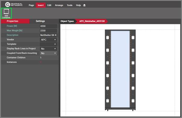
Adding a container in the rack modeler view
Containers appear as light blue squares on the top left corner of the image. After the container is created, simply move and resize it to the desired position on top of the background image.
Now that the container is nicely placed, you want to fill out the container properties, by clicking on it and typing in the right values on the properties window:
- Name: The name of the container that you are creating.
- Rack Units: the number of rack units that will be available for this container. This should be a whole number. For example, choose 44 if that is the number rack units for the container. Technically, you can choose any number of rack units for containers, even if it does not match the number of units for the cabinet. In reality, you will probably always choose containers to fill out the whole rack mountable area, in which case the rack units for the container will match the rack units for the rack.
- Width: the width is defined in inches (usually 19, 21 or 23 for most racks).
- Height: the height is also expressed in inches. Since the height and the number of rack units are independent parameters, in theory this allows for non standard rack unit sizes, but in the vast majority of cases the height is simply the number of rack units multiplied by 1.75 inches. So for example a 44U rack will have a height of 77 inches. For precise rack mounting, the height should always be expressed exactly as the number of rack units multiplied by the 1.75 inches, so do not round this number up or down. For example, a 45U rack should have a height of 78.75 inches.
You are done! The rack is now ready to be used in the project and will inherit all the attributes of the type. This means that as soon as you add an instance of this rack type in the project, you will see the available rack units, power and weight automaticallly added to the rack instance attributes. Double clicking on the rack instance will reveal the background image used and as you start rack mounting devices on it, you will see how they snap in nicely on the rack mountable area. Used rack units will be aggregated automatically and the total power and weight will also be calculated automatically for rack statistics and visual override filters at the rack floor plan level.
5.1.3 Dual view racks (front and back)
Since netTerrain allows more than one container per rack model, you can easily model the front and back view of racks by simply creating two containers during the modeling process and assigning the proper attributes to each.
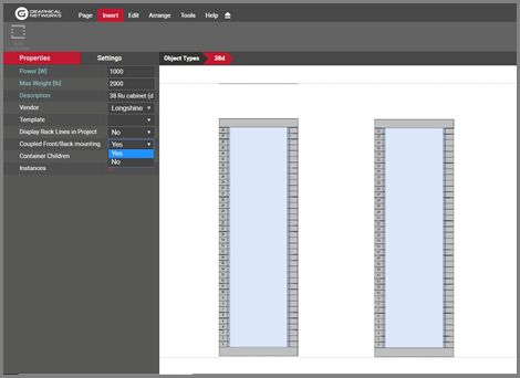
Dual view rack modeling
When creating rack models with front and back views keep the following in mind:
- If possible, choose a background image that shows the rack frames for both views (like the image above).
- Use the same parameters for both containers (rack units, height and width).
- Take advantage of the arrange and resize buttons to ensure that both containers are of the same size.
The purpose of modeling racks with dual views is to be able to show and mount devices on both sides. To add some sizzle to your DCIM project we provide two ways to model a dual rack in netTerrain: the “old” way (ordinary dual racks) and the “new” way, which is by coupling the front and the back.
In ordinary dual racks, all rack units are available on both sides, which means that the number of rack units available when the rack is empty, is the rack unit height times two. As we will see below, you can also design a rack to only allow rack units to be available on either the front or the back so that when you mount a device on one side, the same rack units become unavailable on the other. The latter is the more common usage in Data Center Infrastructure Management, since it better represents how Data Center managers utilize racks.
5.1.3.1 Coupled Front / Back mounting on dual racks
Once you finished modeling the dual view rack you have the choice of having netTerrain display all the devices that you rack mount on one side, on the other side as well. This is called ‘Coupled Front/Back mounting’ (CFBM). CFBM comes in handy when you want to make sure that mounting devices on one side automatically prevents users from mounting devices that utilize any of those same rack units on the other side.
With CFBM when you rack mount a device on the front, netTerrain will show a faint image of the device on the back and vice versa. That way, users already see from a graphical standpoint that those units are unavailable on either side of the rack. The image below shows a dual rack with CFBM enabled, with two devices mounted on the front and a patch panel on the back.
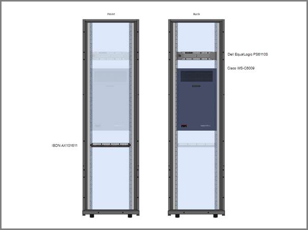
A dual rack with CFBM enabled
To enable CFBM on a rack, simply select ‘yes’ on the ‘Coupled Front/back mounting’ option in the modeler during the rack creation process. You can check that option later, even after the rack was created, however the drop down will be disabled if any instances of the rack already exist in the project. This is to prevent possible inconsistencies in the rack allocation computations, which brings us to the following rules to consider for CFBM:
- CFBM only works for racks that have two containers.
- Both rack containers must be of the same size and number of rack units.
- To enable the CFBM feature on a rack type, no instances of the rack can exist in the project.
- Rack unit availability is not doubled. A 45U dual rack with CFBM enabled will still have only 45 RUs available.
5.1.4 Adding a rack type by dragging and dropping
There is a nice trick to add a rack type into the catalog quickly: by dragging and dropping an image from a folder or browser! This must be done from the project side, from any diagram.
The best way to use this trick is to have both the netTerrain browser and the folder or website with the image side-by-side. Then, just drag and drop the desired image to the netTerrain diagram, as shown below:

Create a rack type by dragging and dropping an image
After you dropped the image on the diagram, netTerrain gives you the option to create it as a floating image, a node type, a device type, or a rack type. Choose the ‘Rack’ option:
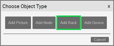
Choosing the ‘__Rack__’ option to create a node type
This completes the modeling process. From here on all that is left is to add custom fields you your rack type.
5.1.5 Special rack fields
Just like with nodes and links, once a rack type has been created, it contains three mandatory fields that exist for every instance of a rack type in the project:
- Id: a 14-digit system-generated number (not visible on the field list view)
- Name: the field that will store the name of each instance
- Type: the field that stores the type of rack
Rack types also contain several special fields: non-editable aggregate values used in conjunction with environmental properties that a user can edit on a per instance basis. These special rack properties are the following:
-
Available Units (aggregated): this is the number of rack units that are still available for the rack
-
Power [W] (inherited from type – editable): this is the predefined static power value assigned in the rack modeler. The existence of this property does not prevent you from creating other power figures as custom properties.
-
Power Used [W] (aggregated): this is the sum of all nameplate power figures for devices rack mounted on that rack. These device nameplate power figures are also created during the device modeling process and are static numbers. netTerrain can also aggregate other power figures into custom fields. For example, dynamic power values could be discovered and automatically populated into a device custom field, and later aggregated as an expression in a rack custom field.
-
Max Weight [lb.] (inherited from type – editable): this is the predefined static weight capacity value assigned in the rack modeler. The existence of this property does not prevent you from creating other custom properties related with weight.
-
Weight Used [lb.] (aggregated): the sum of the device weight rack mounted on that rack. The device weight values are also created during the device modeling process.
In the project these properties manifest themselves as blue system fields, as depicted below:
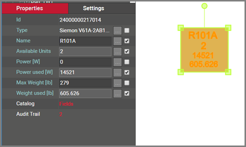
Rack special fields (in blue)
In sum, all rack types contain at least seven system fields. Below is the list of all system fields that exist for a new rack type that was just created in the catalog:
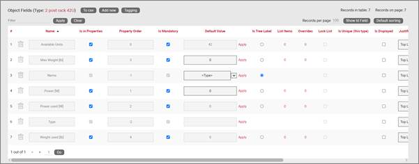
Minimum set of fields (system fields) for racks
Besides the name, which you can edit using one of the default value auto naming functions, notice the two editable environmental fields, which you can edit:
- Max weight
- Power [W]
As mentioned previously, these two fields are inherited by every instance of the rack type and can be edited (or overridden) in the project on an instance-by-instance basis.
5.1.6 Custom rack fields
Just like with nodes and links, and in addition to modeling your rack types according to your specifications, you may want to create custom fields that represent other properties of the rack instances. To create a custom property for a rack type, go to the rack types list and follow these steps:
- Click on the hyperlink that shows the number of fields (7, when there are no custom fields)
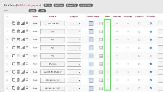
- This will take you to the fields list for that rack type. Click on the ‘Add new’ button
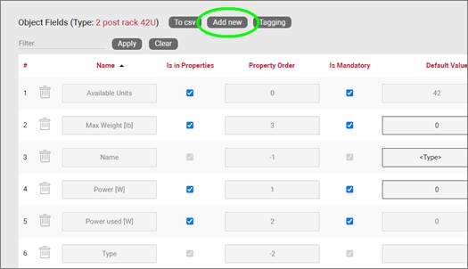
-
This opens the dialog for adding a new field, where you:
-
name the field
- pick a default value for your field
- pick a font size for the field, if it is displayed on the diagram
- set the field as mandatory during the data entry process
- set it as displayed, so that when it is filled out, that value shows up on the diagram (usually next to the rack)
- pick a font color for the field, if it is displayed on the diagram
- pick a fill color for the field, if it is displayed on the diagram
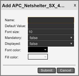
Once the field has been added you can then edit any field parameters from the fields list, as seen previously:
- Name: the field name that will be displayed for the associated object type.
- Is in properties: this feature is useful to control what end users can see on the properties window for a given instance of that type. For example, you can uncheck a field and prevent end users from seeing the data associated with the instances on the project.
- Property order: this is self-explanatory and lets you choose the order in which the property appears in the properties window of the project when you click on an instance of that type
- Is mandatory: if this option is checked it means that some data must be entered into the field when an object instance is created in the project. This is typically used in conjunction with an assigned default value to ensure some data is entered into this field. This field also cannot be deleted if the mandatory check box is enabled.
- Default value: this is the default value that will be displayed for a given field when a new instance of the object type is created. The apply button next to the field lets you apply the default value for that field to all instances of that type in the project.
- Is tree label: determines the data value that will be displayed in the hierarchy browser. Change this if you want to see a different value displayed for an instance of this type in the hierarchy. The default is typically the name.
- List items: list items are like drop down boxes (or combo boxes) that offer end users a finite set of values available for data entry on a given field for a given type. Click on the value to open a table with all list items associated with this field and object type.
- Overrides: click on the value to bring up a list of the overrides associated with this field and object type.
- Lock list: Allow an override list to be non-editable. If this is checked then a user cannot override the list values. They must choose a value that is already in the list.
- Is unique (this type): Restricts all new inputs of this field for this object type to be unique across all instances.
- Is displayed: when checked, the field’s value will be displayed on the diagram for an instance of this object type. This can also be controlled on an instance basis as well as type-wide (see End User Guide).
- Justification: sets the alignment. See the settings for the field instance for more alignment options.
- Font color: the color of the text value that is displayed in the project area diagram for this field. Note that you can change the font on an instance by instance basis from the project as well (see End User Guide).
- Fill color: the background color of the text that is displayed in the project area diagram for this field. Note that you can change the fill color on an instance by instance basis from the project as well (see End User Guide).
- Font size: the size of the text that is being displayed in the project area diagram for this field. Note that you can change the font size on an instance by instance basis from the project as well (see End User Guide).
- Apply Font settings link: applies any font settings for this field to all instances of the object where the field is displayed.
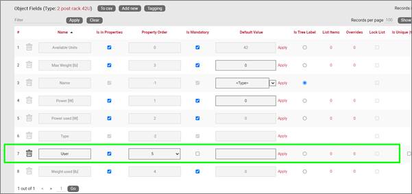
New custom field for a rack type
5.1.6.1 Deleting a custom field
Deleting a custom field is easy: go to the fields list view for the rack type and simply press the delete button on the left of the field you want to remove.
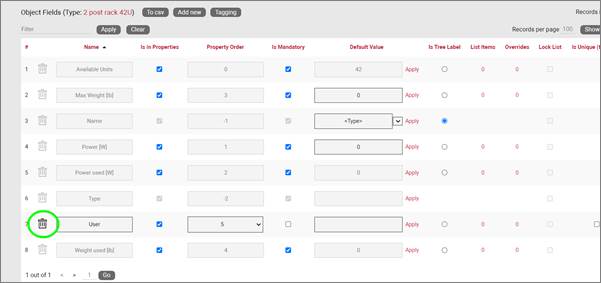
Deleting a custom field for a rack type
Notice that the delete button is not enabled for system fields.
Attention!
As you might expect, all the values for the field corresponding to instances of that type in the project will be deleted. As such, be careful with this operation, since it cannot be undone.
5.1.7 Predefined rack visual overrides
Racks are a bit special in the sense that they already include some predefined overrides. By means of the special system fields we saw above.
Because of aggregate properties being automatically computed for racks, netTerrain can dynamically change the colors of racks based on rack unit occupancy, used power and weight. These visual overrides can be overridden with custom overrides as well, but the main difference between these predefined overrides and custom ones is that the former overrides are included as radio buttons in a Rack Override feature visible in the properties pane (on the project side) that allow users to switch from one override criteria to another, as depicted below.
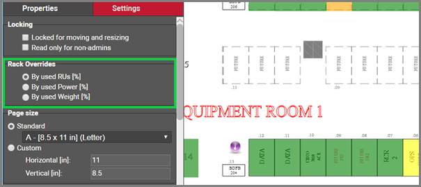
Predefined rack overrides as seen in the project
With this feature, a user can switch from one override criteria to another, and the rack colors will change accordingly. These predefined overrides to have a fixed range of colors based on the following rules:
- 0 to 25% is represented in green
- 25% to 50% is represented in yellow
- 50% to 75% is represented in orange
- 75% and higher is represented in red
5.1.8 Creating list items and visual overrides for a rack field
The predefined overrides seen before can be useful, yet you may want to set your own visual overrides for racks. Just like with nodes, one can access the list items and visual overrides list for a rack type field by clicking on the override number, as shown below:
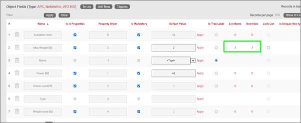
Visual override and list item link for a rack field
To create a new list item or visual override for a rack type field, go to the fields list and follow these steps:
- Click on the hyperlink that shows the number of overrides (obviously 0 when there are none)
- This will take you to the overrides list for that rack type. Click on the ‘Add new’ button
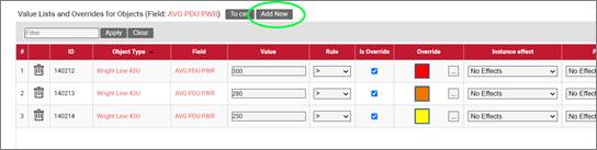
-
This opens the dialog for adding a new override, where you:
-
provide the value that will trigger the override (in the case of a simple list item this is just the list item value)
- specify whether this is an override or not (if you choose false then this completes the process for adding a list item)
- choose the rule that will trigger the override (equal to, contains, greater than, less than)
- set the override image
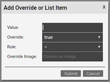
Once the override has been added you can then edit any parameters from the overrides list, as seen before when analyzing nodes:
- Value
- Rule
- Is Override
- Override
- Instance effect
- Parent effect
- Upwards propagation
Attention!
When creating custom visual overrides, these take precedence over any system visual overrides. Once a custom visual override value has been triggered, you will not be able to see the visual override on a system field as netTerrain can only display one type of icon for an instance.
5.1.8.1 Deleting an override or list item
To delete an override or list item for a rack field go to the overrides list view for the rack type and field and simply press the delete button on the left of the entry you want to remove.
5.2 Smart devices
We explained some of the uses of smart devices (or just devices) at the beginning of the chapter. As mentioned above, if you are a user of netTerrain DCIM you probably want to use smart objects in case you need to document entities like routers, switches, cards or cabinets, so that you can take advantage of some of the business rules and automation that netTerrain offers. These business rules and features include:
-
An extensive predefined library of makes and models
-
automatic creation of subcomponents (ports and slot)
-
automatic creation of a background image
-
awareness of physical size and weight
-
easy “snap in” for rack mounting
-
awareness of power consumption
-
ability to receive automatic alarms from the ITK
-
more comprehensive modeling capabilities such as the ability to specify reference node location
-
ability to restrict which card types can be positioned under which slot
-
pre-defined reports in the dashboard
-
Discovery capabilities
Strictly speaking, a device is an instance of a type that was created in the catalog using the type group ‘Device’ during the creation process. Of course, this definition is recursive, but it is up to the user to define what exactly constitutes a device. Because of the flexible nature of netTerrain, you could in theory model anything as a device, but in general it is any box (router, server, UPS, switch, patch panel, etc.) that contains subcomponents (such as ports and slots) and has certain default physical and environmental parameters such as size, power and weight.
During the modeling process, devices are built or “modeled” with specific properties, for instance rack unit size, power and weight capacities. In addition, subcomponents such as ports and slots can be added to a device. As mentioned before, this provides a high degree of automation, since every time an instance of a specific device type is added in the project, all the type properties are inherited, and all the subcomponents are automatically created.
A default installation of netTerrain DCIM contains a few thousand common types, but as you will learn later, adding new ones is not complicated. Moreover, if your netTerrain maintenance contract is current, you can request us to model the devices for you at no extra charge. Cause we are nice people, you know.
5.2.1 Creating a new device
You can create a new device type in a few different ways:
- Import a Json or Zip device package
- Create the device manually step-by-step from the catalog
- Drag and drop an image from a browser or folder and follow the rest of the process manually
In this section we will go over the import and manual creation process and later we will review the detailed manual modeling process.
5.2.1.1 Creating a device from a Json or Zip package
One of the beauties of maintenance is that Graphical Networks can model device, card and rack types for you. To do so, simply enter a ticket in your support portal with basic information about make and model and we will model the device with its backplane image, subcomponents and more. We will then deliver a Zip or Json file to you, which you can then import into your catalog.
To import the file into the catalog simply go to the catalog Device section, click on ‘Import Zip’ or ‘Import Json’ at the top, browse for your file and voila!
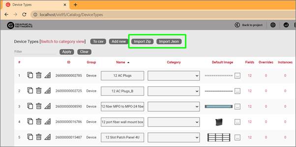
5.2.1.2 Creating a device manually
To add a new device, go to the catalog and look for the ‘Add New’ button next to the devices group. You can also click on the # value next to the ‘Devices’. This will list all existing devices. Then you can click on the ‘Add New’ button.
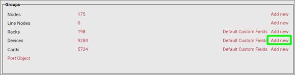
Adding a new device type to the catalog
Pressing the add button will bring up a pop-up dialog box that can be used to create a new device type in the catalog.
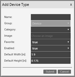
Add device form
Let’s review each field:
- Name: must be unique and cannot exceed 255 characters.
- Image: this is a mandatory step when creating a device. The supported image types include PNG, JPEG, GIF, and SVG. The image that is uploaded will be the image that will be displayed when the device is used in a diagram, unless overridden by a visual override. You will also see a thumbnail of the image in certain catalog list views. The image will be uploaded and stored on the netTerrain application server.
- Favorite: set the value as true if you would like the new device to show up in the favorites list in the project. Favorites are filtered from the rest of the types on the project side when clicking on the ‘Device’ button in the insert menu or checking the ‘fav’ option in the floating catalog.
- Enabled: if you would like the device type to show up in the type drop down box list when you work with device instances then it needs to be enabled. This list is displayed when you click on an existing device that has been added to a diagram. Disabled devices are automatically removed from the favorites list.
- Default Width: the default width of new devices of this type when added to a diagram. Units are in inches.
- Default Height: The default height of this new device type when added to a diagram. This value is in inches.
Important to note is that the previous sizes refer to the image of the device node, not the physical dimensions that will be computed when rack mounting the device. Devices have effectively two distinct sets of dimensions: one that is only relevant in terms of the relative size of the node on a diagram (the default width and size shown above) and only has meaning in terms of what you would want the default size of that node to be when added to the project diagram, and the other one representing the actual physical size of the device when rack mounted. The physical sizes are defined later in this section, when we model devices, but to keep it simple, many users use the same set of dimensions for both sets. All dimensions for both sets are specified in inches.
After submitting the new device type, it is added to the list of devices. From the device list you can rename the device type assign it to a custom category for better organization, change the default image, or create custom fields and visual overrides, as depicted below:
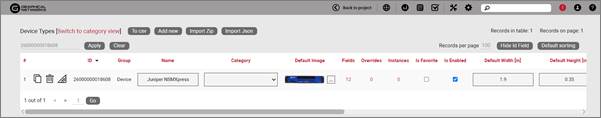
New device type displayed in the device list view
Also, from the device list you can control the following settings for each device:
- mark the device as favorite: this will make the device show up in the floating catalog under favorites
- Enable or disable it from the catalog in the project
- Set the default width and height
- Force to keep the aspect ratio during resizing
- Assign a default template to it
- Set the SNMP system object Id for automated type mapping in a discovery
As we mentioned above, just like we did with regular nodes, you can add custom fields, define visual overrides, assign the type to a category and so on. You can refer to the generic node type section to review each one of these operations.
5.2.1.3 Limiting inventory with the ‘In stock’ option
If you would like to use netTerrain for inventory control, the ‘In Stock’ option lets you limit the number of instances of a given device type that can be added in the project.
This field is optional and if a device type has a set ‘In stock’ value, then any user trying to import or drag and drop a device of that type into the project, can only do so as long as the number of instances does not exceed said value.
To remove any existing inventory limits, simply blank out the field.
5.2.1.4 Custom OIDs
One important difference between the custom field creation for a generic node and a device is that device fields can have an associated custom OID. Without going into too much detail, an OID is an Object Identifier used in the SNMP discovery protocol to identify a property to be discovered for a device. When using the netTerrain discovery collector, netTerrain can automatically request a scan of a specific OID if the discovered device also matches the netTerrain type, which is done via the SystemOId.
5.2.1.5 Default custom fields for devices
In many projects that utilize a variety of device types, there may be a set of common fields that apply to any type. To save yourself the effort of having to create these fields every time, for every new device type you add in the catalog, you can predefine the default custom fields that netTerrain should create automatically after adding a new device type.
These default custom fields for devices can be managed from the catalog dashboard:
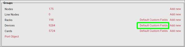
Defining default custom fields for devices
After clicking on the ‘Default Custom Fields’ link you are taken to a list view where you can manage these default custom fields, as shown below:
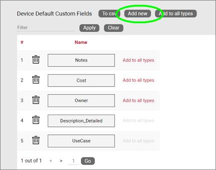
Device type default custom fields management
Notice that when you add a new default custom field to the list, the field will be added to any new types created but will not modify the structure of custom fields for existing types. You can, however, apply the defined default custom fields to all existing types by pressing on the ‘Add to all types’ button.
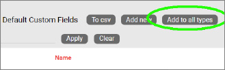
Applying default custom fields to all types
5.2.2 Device modeling process
The device modeling process lets you assign a backplane image to the device and overlay subcomponents on top of it, so that end users don’t have to manually create them for each instance.
In addition to creating subcomponents, the device modeling process lets you specify properties for the device.
After the initial creation of the device, you can proceed with the modeling. If you are still in the list view for the device you created, you should see a ‘Modeler’ button  . If you are not in the device list view, go to the ‘Catalog’ and click on the device group # count.
5.2.2.1 Device properties
To get started with the modeling process, first fill in the device properties, as displayed below.
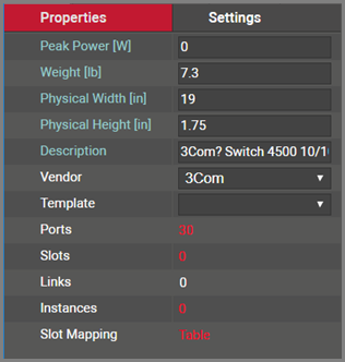
Device properties in modeler
These properties include:
- Peak Power [W]: maximum power that this device type supports. This is not a mandatory field and can be modified on a per device instance basis. As such, we could say that this value represents the nameplate device peak power. When rack mounting devices, this is the value that is aggregated in the rack power computation. Check with the manufacturer of the device to get the power specifications for the type.
- Weight [lb]: nameplate weight of the device type. This is not a mandatory field and can be modified on a per device instance basis. When rack mounting devices, this is the value that is aggregated in the rack weight computation.
- Description: non-mandatory field used as a short description for this rack type
- Vendor: this field is a non-mandatory lookup value from the vendors table. If the vendor is not in the list it will need to be added before proceeding (see previous chapter).
- Template: if the device will use a standard default diagram template it can be assigned here (see End User Guide for template usage).
- Ports: this represents the number of ports on the motherboard of this device type. Click on this # and a table view of the ports will be displayed and can be edited. Note that this number does not account for any ports associated with cards that can be placed on device slots.
- Slots: this represents the number of slots on the motherboard. Slots can be used to mount cards, once card types have been mapped to slots (more on this later).
- Links: this number represents the count of internal links that have been modeled for this type. Typically, this is done for patch panels or other devices where a certain number of links are always present even when the device has no external connections. This feature is useful to for example, when you want to define internal cross connections for the internal device matrix, or physical cross connections between front and back panels (more on this later).
- Instances: the number of occurrences of this type in the project. Naturally, this value is zero if you are modeling this device type for the first time.
5.2.2.2 Backplane image
Once the properties have been entered for the device you can proceed with the actual modeling sequence. First, you need to create a background image that will serve as a guide for placing port or slot objects on top of it. Ideally, the device image should display the backplane of the device and serve as a reference for users assigning ports to it.
Note that some devices have ports on both sides, so it is not uncommon to use a composite device image that has both the front and back view.
To add the background image, click on the  icon in the Page menu. You will then be able to browse for an image on your local drive. Valid image formats include png, jpg, gif as raster formats and svg as vector formats.
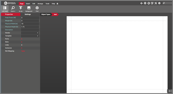
Empty modeler page for a new device type
5.2.2.3 Port modeling
After uploading the background image for the device you can proceed with the modeling of subcomponents (ports and slots). To create a new port for the type simply click on the add port button located in the toolbar. For convenience (especially useful for devices that have multiples of 6 ports) there is also a button to add 6 ports at once.
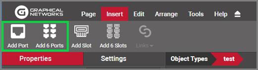
Buttons to add ports in device model
Another convenient way of creating multiple ports is using the copy 6 and copy 24 options in the port right click context menu (more on that later).
Proceed to move and resize the ports as needed. Take advantage of the arrange and resize buttons on the toolbar.
Each port is an object in its own right. As such, when these ports are automaticallly created in the project, they will inherit default properties from the modeler. These values can be overridden on a per instance basis. These default properties include:
- Name: the name of the port. The default value is numeric and starts with 1 when the first port is created for the device type.
- Protocol: The physical port protocol is user defined, and can be overridden on a per instance basis. Examples of protocol values include ethernet, V.35, fast ethernet, etc.
- Connector: this is a descriptive field that comes in handy when assigning visual overrides based on the port connector. These values are user defined and can be overridden on a per instance basis. Examples of connector values include RJ45, SC or LC.
Note that ports can also have additional fields added to them. To do so, go to the catalog and find the ‘Port’ object. Click on it and add custom fields just like with any other type.
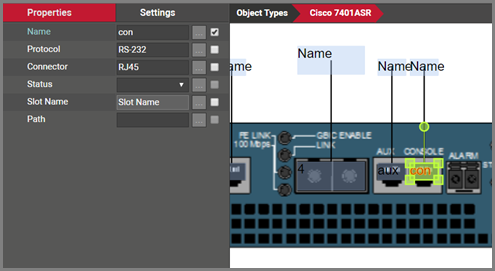
Port modeled on top of a device backplane
Ports have certain right click context menu options, for easy manipulation and modeling:
-
Delete: deletes the selected ports. Note that you can delete ports using the toolbar buttons as well and any deleted ports will delete every occurrence of that port in the project.
-
Select all of type: selects all instances of references for that type
-
Copy 6: creates 6 copies of the selected port. This option is only enabled when one port is selected.
-
Copy 24: creates 24 copies of the selected port. This option is only enabled when one port is selected.
-
Connect to: this option lets you create pre defined internal connections between ports on the current device types. As explained above, these per defined links are usually utilized in the context of cross connections.
-
Create Connections: If another port has been copied to the clipboard, this option will be available for creating a link. When selected a dialog will appear.
-
Apply size to all of type: applies the size of the selected port (only enabled when one is selected) to the rest of the ports.
-
Apply to all instances: applies the settings of the selected ports, to all occurrences of those ports in the project.
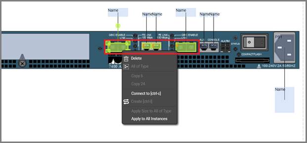
Right click context menu options for ports
5.2.2.4 Modeling references
The screenshot above shows a white “name” box. These boxes are created automatically for each port and is called the reference port object. This object is not real, it is just a representation of the location where a reference node would show up, when you connect the port with another node in the project. The white box then provides a convenient way for nicely auto-placing references in the project. In the project, the reference port is only visible after a connection is made to the physical port for an instance of that device type.
It is preferrable to first model the size and position of the “real” ports and then proceed with the resizing and positioning of the references. Sometimes when modeling the “real” ports, these white boxes get in the way (especially for devices with many ports). For that purpose in the modeler you can hide the references, work with the real ports, then display the references again and proceed to model the reference ports. To hide the references simply right click on them and select hide.
Use some of the other right click context options for reference ports:
-
Select all of type: selects all instances of references for that type
-
Resize: provides options to match the width and height of the selected reference/s to the dimensions of the connecting port/s.
-
Align: provides options to align the selected reference ports with its connected physical port
-
Apply size to all of type: applies the size of the selected reference (only enabled when one reference is selected) to the rest of the references
-
Apply to all instances: applies the settings of the selected references, to all occurrences of those references in the project
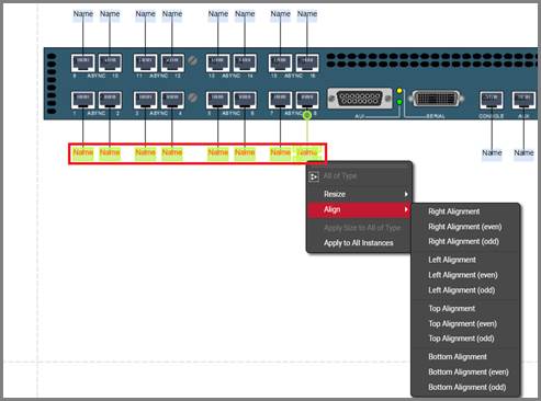
Right click context menu options for references
5.2.2.5 Working with text and displayed fields
As explained above, ports can have an unlimited number of custom fields, and you can choose which ones will be displayed on the diagram by default. Port and reference port displayed fields can also be set in advance in the modeler so that they follow a pre defined pattern for each instance in the project. This saves time when creating nice looking device diagrams. Users can edit each text by double clicking on the displayed field or by right clicking on it and selecting ‘Text’. Text can be resized and also rotated using the rotation handler.
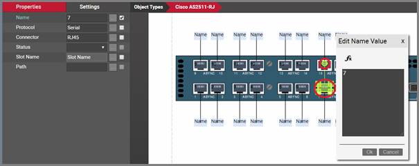
Editing the text for a port. Rotation handler is shown in the smaller red indicator
To select which fields should be displayed by default, simply select the port and check the applicable fields on the properties window, as shown below.
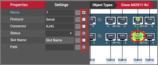
Port displayed field selection
5.2.2.6 Modeling reference node display field positioning
Selecting a reference node will display a list of all the “port” fields available. These fields can be used to pre-define the default position of a reference node displayed field.
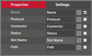
Reference node display field selection list
By placing a check mark next to the field name it will enable the field within the modeler. Ultimately this will make the field data for this field type display when the device is used and a connection exists with this port.
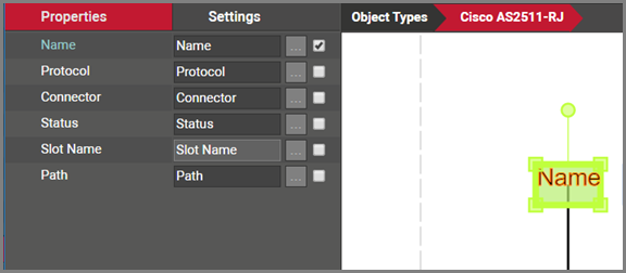
Reference node fields marked for display
5.2.2.7 Creating predefined links (or cross connections)
As mentioned above, in many cases users want to represent internal connections between ports on the same device and these connections repeat themselves throughout most or all instances of a device type. Examples include internal logical connections for a switch matrix, or physical cross connections between front and back sides of patch panels.
Why would we want to track this? Picture this example: a circuit that traverses certain devices and enters a patch panel. The patch panel has a front and a back side where ports 1f (front) through 24f (front) are always connected to ports 1b (back) through 24b (back). If we were to run a circuit layout record (end to end view of the circuit, see end user guide for this feature) for the circuit, its representation would terminate at the patch panel if these ports are not cross connected.
Also, we may want to understand internal properties of these cross connections, which can be tracked with custom properties assigned to the links representing them.
To create a cross connection in the catalog you can select the two endpoints and then click on the link butneton on the toolbar and select which link type will be used.
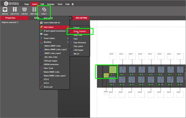
Single cross connection creation process in the modeler
You can also create multiple cross connections at once by following this process:
-
select all the starting ports
-
copy them to the clicpboard
-
select the end ports
-
right click and select create connections
-
pick the connection pattern and link type
-
click ‘Ok’
Note that you can cross connect multiple ports using different sequencing patterns:
-
By name: will choose the starting and ensing sequences based on alphabetic sorting of port sets
-
By horizontal position: will match the first element of the starting port set with the first element of the ending port set, and so on, using the horizontal positions as ordering criteria
-
By vertical position: will match the first element of the starting port set with the first element of the ending port set, and so on, using the vertical positions as ordering criteria
-
All to all: will connect every port of the copied set with every port of the selected set.
netTerrain is smart enough to know how to connect ports if the starting and ending sets don’t match. Also you can connect one port to many in one simple process by copying the one port to the clipboard, selecting the ending ports and then using the ‘All to all’ option.
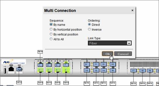
Multi cross connect option
5.2.2.8 Modeling bend points
Any lines used in the context of reference ports or internal cross connections can include bend points. This means that when an instance of this device is created in the project, lines generated by references, as well as internal links will already include those predefined bend points. This can be useful in busy diagrams where you want to reroute lines to make the model look better or in such cases where the backplane image itself includes the representation of the lines.
The modeling of bend points works the same way as in the project: right click on any link and add the bend point or press ‘b’.
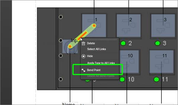
Modeling bend points in the catalog
Once you are done modeling bend points, don’t forget to press the ‘Apply Settings to all instances’ button if you also want these bend points to appear on any existing instances of that model in the project.
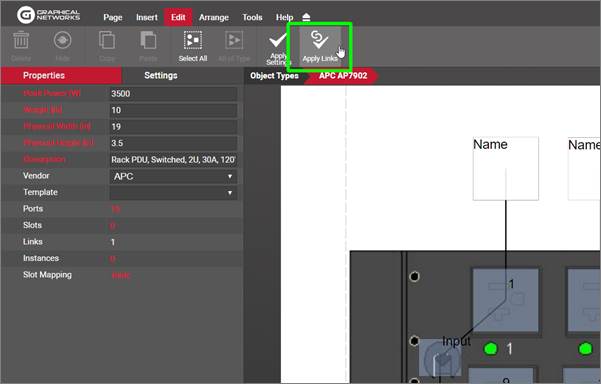
Applying bend points to existing instances
5.2.3 Modeling slots
In addition to modeling ports you can model slots by clicking on the add slot button in the insert menu. As with ports, there is a button to add 6 slots in one click.
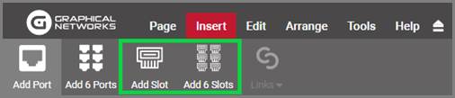
Buttons to add slots to a device model
Once slots have been added, they can be positioned and resized on top of the device backplane image. Each slot name can also be edited.
Slots are displayed as white rectangles in the modeler, so it may be convenient to work with them, with any reference ports hidden, since they are also white.
Just like with ports, slots can also have additional custom fields. Find the slot type in the catalog and proceed to add fields using the same steps as with ports.
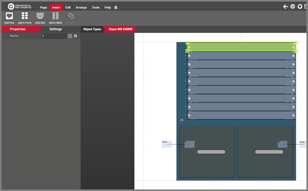
Slot element in modeler
5.2.3.1 Mapping cards to slots
Slots are not very useful unless they support cards. netTerrain has a high degree of control regarding which card types can be mapped to which slot. What this means is that whenever an end user clicks on a slot in the project, a drop-down list of possible cards that can be associated to that slot is provided. To map cards to slots, the card type must obviously already exist in the catalog (see next section on how to create cards in the catalog).
Cards can be mapped to slots by clicking on the “slot mapping” link available in the properties window for the device modeler.
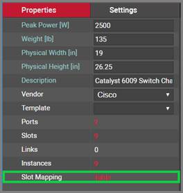
Slot mapping feature in device modeler
After clicking on the ‘Table’ link displayed above, a slot mapping table is displayed. For new device types, or devices that have no cards mapped to its slots, the list will be empty.
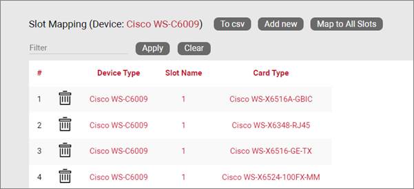
To map a single card to a specific slot press the ‘Add New’ option. This will allow you to map a card to a specific slot number. Next, you can pick the slot number you want to map cards to and the card type that goes with that slot.
Since the list of cards can be a very lengthy one, we suggest taking advantage of the filter option to narrow down your choices.
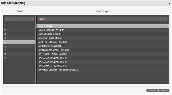
Slot mapping dialog
If a card should be mapped to all slots then use the ‘Map to all slots’ option. After the cards are mapped to the proper slots, all mappings for the device type will be displayed in the list view. The list view includes the following links:
-
Delete: will delete the mapping from the list (this will not remove any existing cards of that type already assigned to that slot in the project)
-
Device type: a link to go to the catalog definition of the device
-
Slot Name: a shortcut to go to the modeler and highlighted the slot on the chassis
-
Card Type: a link to go to the catalog definition of the card
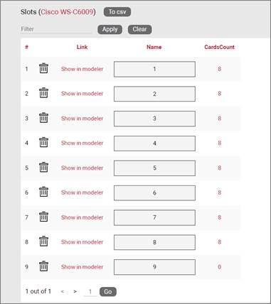
Populated slot mapping table
5.2.4 Adding a device type by dragging and dropping
There is a nice trick to add a device type into the catalog quickly: by dragging and dropping an image from a folder or browser! This must be done from the project side, from any diagram.
The best way to use this trick is to have both the netTerrain browser and the folder or website with the image side-by-side. Then, just drag and drop the desired image to the netTerrain diagram, as shown below:
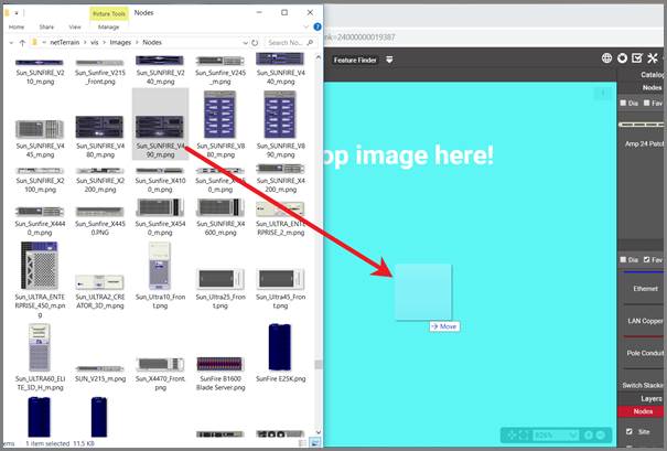
Create a device type by dragging and dropping an image
After you dropped the image on the diagram, netTerrain gives you the option to create it as a floating image, a node type, a device type, or a rack type. Choose the ‘Device’ option:
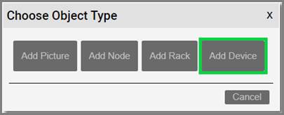
Choosing the ‘__Device__’ option to create a node type
This completes the process; however, it is up to you to access the catalog for that type and then add any custom properties or behaviors or model the device itself.
5.2.5 Special device fields
Just like with nodes and links, once a device type has been created, it contains three mandatory fields that exist for every instance of a device type in the project:
- Id: a 14-digit system-generated number (not visible on the field list view)
- Name: the field that will store the name of each instance
- Type: the field that stores the type of device
Device types also contain a few special fields: environmental properties that a user can edit on a per instance basis and are inherited from the type once you start instantiating them in the project. These special device properties are the following:
-
Peak Power [W]: this is the predefined static nameplate power value assigned to the type. Typically, the value entered here is the nameplate power published by the vendor.
-
Weight [lb.]: this is the predefined static weight published by the vendor. For modular equipment you may choose whether to populate it with an empty, average or fully loaded configuration. When using the empty configuration, you can create your own expression in netTerrain to aggregate the computed actual weight based on the loaded cards.
-
Status (non-mandatory): a value usually associated with the ability of the device in a production environment to respond to a request.
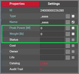
_Device special fields _
In sum, all device types contain at least five system fields. Below is the list of all system fields that exist for a new device type that was just created in the catalog:
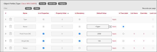
Minimum set of fields (system fields) for devices
Besides the name, which you can edit using one of the default value auto naming functions, notice the two editable environmental fields, which you can edit:
- Max weight
- Power [W]
As mentioned previously, these two fields are inherited by every instance of the device type and can be edited (or overridden) in the project on an instance-by-instance basis.
5.2.6 Custom device fields
Just like with nodes and links, and in addition to modeling your device types according to your specifications, you may want to create custom fields that represent other properties of the device instances. To create a custom property for a device type, go to the device types list and follow these steps:
- Click on the hyperlink that shows the number of fields (5, when there are no custom fields)
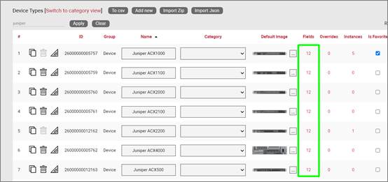
- This will take you to the fields list for that device type. Click on the ‘Add new’ button
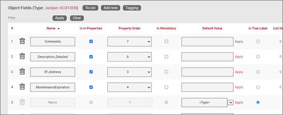
-
This opens the dialog for adding a new field, where you:
-
name the field
- pick a default value for your field
- pick a font size for the field, if it is displayed on the diagram
- set the field as mandatory during the data entry process
- set it as displayed, so that when it is filled out, that value shows up on the diagram (usually next to the device)
- pick a font color for the field, if it is displayed on the diagram
- pick a fill color for the field, if it is displayed on the diagram
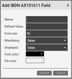
Once the field has been added you can then edit any field parameters from the fields list, as seen previously:
- Name: the field name that will be displayed for the associated object type.
- Is in properties: this feature is useful to control what end users can see on the properties window for a given instance of that type. For example, you can uncheck a field and prevent end users from seeing the data associated with the instances on the project.
- Property order: this is self-explanatory and lets you choose the order in which the property appears in the properties window of the project when you click on an instance of that type
- Is mandatory: if this option is checked it means that some data must be entered into the field when an object instance is created in the project. This is typically used in conjunction with an assigned default value to ensure some data is entered into this field. This field also cannot be deleted if the mandatory check box is enabled.
- Default value: this is the default value that will be displayed for a given field when a new instance of the object type is created. The apply button next to the field lets you apply the default value for that field to all instances of that type in the project.
- Is tree Label: determines the data value that will be displayed in the hierarchy browser. Change this if you want to see a different value displayed for an instance of this type in the hierarchy. The default is typically the name.
- List Items: list items are like drop down boxes (or combo boxes) that offer end users a finite set of values available for data entry on a given field for a given type. Click on the value to open a table with all list items associated with this field and object type.
- Overrides: click on the value to bring up a list of the overrides associated with this field and object type.
- Lock List: Allow an override list to be non-editable. If this is checked then a user cannot override the list values. They must choose a value that is already in the list.
- Is Unique (this type): Restricts all new inputs of this field for this object type to be unique across all instances.
- Is Unique (all types): Restricts all new inputs of this field for any object type to be unique across all instances.
- Is displayed: when checked, the field’s value will be displayed on the diagram for an instance of this object type. This can also be controlled on an instance basis as well as type-wide (see End User Guide).
- Justification: sets the alignment. See the settings for the field instance for more alignment options.
- Font color: the color of the text value that is displayed in the project area diagram for this field. Note that you can change the font on an instance by instance basis from the project as well (see End User Guide).
- Fill color: the background color of the text that is displayed in the project area diagram for this field. Note that you can change the fill color on an instance by instance basis from the project as well (see End User Guide).
- Font size: the size of the text that is being displayed in the project area diagram for this field. Note that you can change the font size on an instance by instance basis from the project as well (see End User Guide).
- Apply Font settings link: applies any font settings for this field to all instances of the object where the field is displayed.
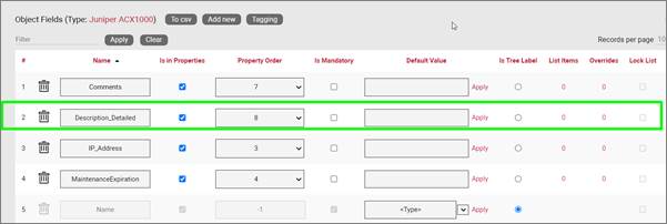
New custom field for a device type
5.2.6.1 Deleting a custom field
Deleting a custom field is easy: go to the fields list view for the device type and simply press the delete button on the left of the field you want to remove.
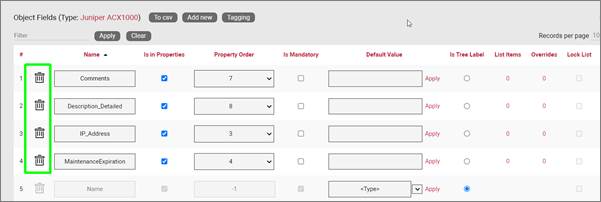
Deleting a custom field for a device type
Notice that the delete button is not enabled for system fields.
Attention!
As you might expect, all the values for the field corresponding to instances of that type in the project will be deleted. As such, be careful with this operation, since it cannot be undone.
5.2.7 Creating list items and visual overrides for a device field
Just as with nodes or racks you may want to set your own visual overrides for devices. You can access the list items and visual overrides list for a device type field by clicking on the override number, as shown below:
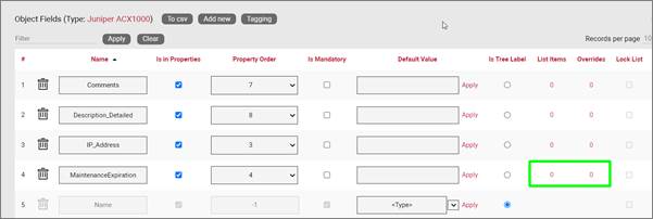
Visual override and list item link for a device field
To create a new list item or visual override for a device type field, go to the fields list and follow these steps:
- Click on the hyperlink that shows the number of overrides (obviously 0 when there are none)
- This will take you to the overrides list for that device type. Click on the ‘Add new’ button
-
This opens the dialog for adding a new override, where you:
-
provide the value that will trigger the override (in the case of a simple list item this is just the list item value)
- specify whether this is an override or not (if you choose false then this completes the process for adding a list item)
- choose the rule that will trigger the override (equal to, contains, greater than, less than)
- set the override image
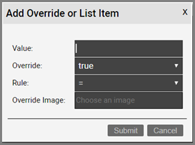
Once the override has been added you can then edit any parameters from the overrides list, as seen before when analyzing nodes:
- Value
- Rule
- Is Override
- Override
- Instance effect
- Parent effect
- Upwards propagation
5.2.7.1 Deleting an override or list item
To delete an override or list item for a device field go to the overrides list view for the device type and field and simply press the delete button on the left of the entry you want to remove.
5.2.8 Port object
The port object is a special object in the catalog which manages the properties and behaviors of port instances in the project. The creation of ports in the project only happens as a consequence of creating devices or cards and are only instantiated as children of said devices or cards. For each device and card type, their corresponding ports are laid out and predefined as children using one type of entity, which is this port object. As such, the port object does not allow for different types, but catalog managers can modify this port object in terms of adding new properties, behaviors, and other basic physical properties.
To access the port object, click on the ‘port object’ hyperlink in the main catalog page:
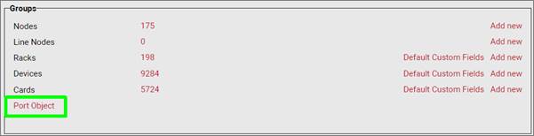
The port object list, which uses the same format as other object type lists, only displays one entry, which cannot be deleted or cloned:
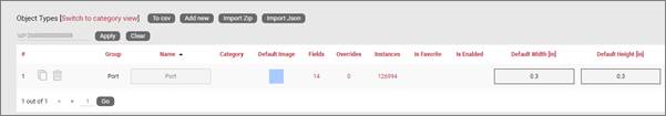
Port object list
Let’s review each field:
- Name: the name of this type is always “Port” and cannot be changed.
- Category: this entry is empty and cannot be edited as there can’t be multiple port object types and it can’t be associated with entities from different sections in the catalog.
- Default image: the supported image types include PNG, JPEG, GIF, and SVG.
- Fields: users can add custom fields, just like it is done for device types, node types and so on.
- Overrides: users can modify the behavior of ports by creating custom overrides, just like it is done for device types, node types and so on.
- isFavorite and IsEnabled: these settings are not editable for ports as ports are created automatically for the device and card types for ports are modeled.
- Default width and height: these settings refer to the default width and height displayed on the modeler page of devices and cards. When a power user models the ports for a given device or card type the individual port sizes modeled for said types override these defaults.
5.3 Creating and modeling cards
Cards are used in netTerrain DCIM to work in conjunction with their parent devices and are mapped to specific device slots. Cards are modeled in a similar way as devices. The basic difference between a card and a device is that a card is not rack mounted on a rack, but only positioned inside a device slot. Users can also model daughter cards (sometimes called modules) which are cards positioned inside cards. We saw this in the hardware model previously. This dependency can have unlimited nesting levels (cards inside cards inside cards, etc.). For this nesting to work, the card modeling process must also support slots.
As mentioned before, slots are placeholders for cards and they are defined in the catalog, typically on top of the device backplane image. Devices that contain slots are sometimes referred to as modular. Slots cannot be moved or resized for an instance (it wouldn’t make much sense to do so, when was the last time you could stretch a card on a router!). Slots that have been mapped to card types in the catalog can be populated with instances of those types. The card types that are available will depend on the catalog setup, which we will review when we go over hardware mapping.
In the project, to assign a card on a slot a user simply selects the slot, and then picks the card type to place in it, using the type drop down box. The card modeling and hardware mapping in the catalog is what makes all this magic work.
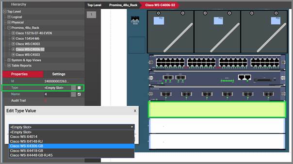
Populating a slot with a card, as seen in the project
A card is modeled in the catalog pretty much like a device. A card can contain:
- Ports
- A background image
- Other slots with cards (or daughtercards)
Once a card has been created, its ports are also created automatically, just like with a device. To see the ports and other subcomponents inside a card just double-click on it.
Card backplane with automatically created ports, as seen in the project
5.3.1 Predefined card properties
Cards, just like devices, have the same two predefined properties that are inherited from the catalog:
-
Peak Power [W]: this is the predefined nameplate power assigned in the card modeler.
-
Weight [lb]: this is the predefined static weight capacity assigned in the card modeler.
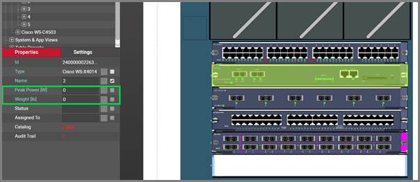
Predefined card fields as seen in the project
These properties can be overridden on an instance by instance basis. Also, users can create additional custom fields representing power readings, which can in turn be the result of a discovery or some other importing mechanism.
Card dimensions and power consumption can also be modeled, but the play a minor role in the project. Racks do not currently aggregate card name plate power figures, so we recommend that when you specify power for devices you should account for the maximum power when the device is fully loaded with cards. Also, since cards are mapped to slots, the card dimensions become irrelevant from a diagramming perspective, since the cards will automatically fit inside the slot the card is mapped to.
5.3.2 Adding cards
To add a new card, go to the catalog and look for the ‘Add New’ button next to the cards group. You can also click on the # value next to the ‘Cards’. This will list all existing cards. Then you can click on the ‘Add New’ button.
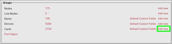
Adding a new card type in the catalog
Pressing the add button will bring up a pop-up dialog box that can be used to create a new card type in the catalog.
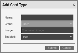
Adding card type dialog
Once the card has been added to the catalog, netTerrain shows the new type in the card list view.
As you probably know from the device creation process, in netTerrain you can add as many custom fields as possible, on a per card type basis. This gives you maximum granularity when it comes to recording important properties for these objects. Any property for the card can also have visual overrides that can control the look and feel of a card based on changes in any property.

Card properties
As you have seen already, card fields can have all sorts of settings: the order in which they appear in the properties window, whether they are mandatory or not, default values, list items and visual overrides, whether values need to be unique, whether they are displayed on the actual diagram or not and if so, what font type, color, size and so on these properties use.
5.3.2.1 Default custom fields for cards
In many projects that utilize a variety of card types, there may be a set of common fields that apply to any type. To save yourself the effort of having to create these fields every time, for every new card type you add in the catalog, you can predefine the default custom fields that netTerrain should create automatically after adding a new card type.
These default custom fields for cards can be managed from the catalog dashboard:
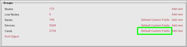
Defining default custom fields for cards
After clicking on the ‘Default Custom Fields’ link you are taken to a list view where you can manage these default custom fields, just like how it is done for devices.
Notice that when you add a new default custom field to the list, the field will be added to any new types created but will not modify the structure of custom fields for existing types. You can, however, apply the defined default custom fields to all existing types by pressing on the ‘Add to all types’ button.
Applying default custom fields to all types
5.3.3 Card modeling
The card modeling process is the same as the process followed for devices, so you can always refer to that section of the guide. We’ll review the entire process here again.
The card modeling process lets you assign a backplane image to the card and overlay subcomponents on top of it, so that end users don’t have to manually create them for each instance. In addition to creating subcomponents, the card modeling process lets you specify physical properties for the cards. These physical properties should not be confused with the custom fields we mentioned
After the initial creation of the card, you can proceed with the modeling. If you are still in the list view for the card you created, you should see a ‘Modeler’ button  . If you are not in the card list view, go to the Catalog and click on the card group # count.
5.3.3.1 Card properties
To get started with the modeling process, first fill in the card properties, as displayed below.
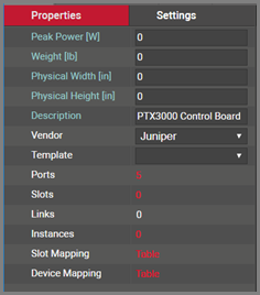
Card properties in modeler
These properties include:
- Peak Power [W]: maximum power that this card type supports. This is not a mandatory field and can be modified on a per card instance basis. As such, we could say that this value represents the nameplate card peak power.
- Weight [lb]: nameplate weight of the card type. This is not a mandatory field and can be modified on a per card instance basis.
- Physical Width and Height [in]: as mentioned before, not very relevant from a diagramming perspective, since the cards will automatically fit inside the slot the card is mapped to.
- Description: non-mandatory field used as a short description for this rack type
- Vendor: this field is a non-mandatory lookup value from the vendors table. If the vendor is not in the list it will need to be added before proceeding (see previous chapter).
- Template: if the card will use a standard default diagram template it can be assigned here (see End User Guide for template usage).
- Ports: this represents the number of ports on the motherboard of this card type. Click on this # and a table view of the ports will be displayed and can be edited.
- Slots: this represents the number of slots on the card. Slots can be used to mount daughtercards.
- Links: this number represents the count of internal links that have been modeled for this type, which is not very common for cards.
- Instances: the number of occurrences of this type in the project. Naturally, this value is zero if you are modeling this card type for the first time.
5.3.3.2 Backplane image
Once the properties have been entered for the card you can proceed with the actual modeling sequence. First, you need to create a background image that will serve as a guide for placing port or slot objects on top of it. Ideally, the card image should display the backplane of the card and serve as a reference for users assigning ports to it.
To add the background image, click on the  icon in the Page menu. You will then be able to browse for an image on your local drive. Valid image formats include PNG, JPG, GIF as raster formats and SVG as vector formats.
5.3.3.3 Port modeling
After uploading the background image for the card you can proceed with the modeling of subcomponents. To create a new port for the type simply click on the add port button located in the toolbar. For convenience (especially useful for cards that have multiples of 6 ports) there is also a button to add 6 ports at once.
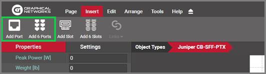
Buttons to add ports in card model
Another convenient way of creating multiple ports is using the copy 6 and copy 24 options in the port right click context menu.
Proceed to move and resize the ports as needed. Take advantage of the arrange and resize buttons on the toolbar.
Each port is an object in its own right. As such, when these ports are automaticallly created in the project, they will inherit default properties from the modeler. These values can be overridden on a per instance basis. These default properties include:
- Name: the name of the port. The default value is numeric and starts with 1 when the first port is created for the card type.
- Protocol: The physical port protocol is user defined, and can be overridden on a per instance basis. Examples of protocol values include ethernet, V.35, fast ethernet, etc.
- Connector: this is a descriptive field that comes in handy when assigning visual overrides based on the port connector. These values are user defined and can be overridden on a per instance basis. Examples of connector values include RJ45, SC or LC.
Note that ports can also have additional fields added to them. To do so, go to the catalog and find the ‘Port’ object. Click on it and add custom fields just like with any other type.
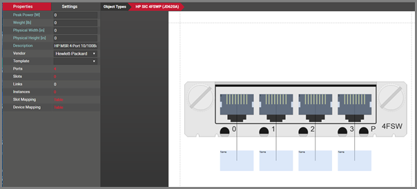
Port modeled on top of a card backplane
Ports have certain right click context menu options, for easy manipulation and modeling:
-
Delete: deletes the selected ports. Note that you can delete ports using the toolbar buttons as well and any deleted ports will delete every occurrence of that port in the project.
-
Select all of type: selects all instances of references for that type
-
Copy 6: creates 6 copies of the selected port. This option is only enabled when one port is selected.
-
Copy 24: creates 24 copies of the selected port. This option is only enabled when one port is selected.
-
Connect to: this option lets you create pre defined internal connections between ports on the current card types. As explained above, these per defined links are usually utilized in the context of cross connections, not a common scenario for cards.
-
Create Connections: If another port has been copied to the clipboard, this option will be available for creating a link. When selected a dialog will appear.
-
Apply size to all of type: applies the size of the selected port (only enabled when one is selected) to the rest of the ports.
-
Apply to all instances: applies the settings of the selected ports, to all occurrences of those ports in the project.
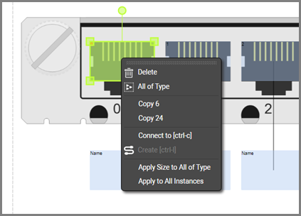
Right click context menu options for ports
5.3.3.4 Modeling references
The screenshot above shows a white “name” box. These boxes are created automatically for each port and is called the reference port object. This object is not real, it is just a representation of the location where a reference node would show up, when you connect the port with another node in the project. The white box then provides a convenient way for nicely auto-placing references in the project. In the project, the reference port is only visible after a connection is made to the physical port for an instance of that card type.
It is preferrable to first model the size and position of the “real” ports and then proceed with the resizing and positioning of the references. Sometimes when modeling the “real” ports, these white boxes get in the way (especially for cards with many ports). For that purpose in the modeler you can hide the references, work with the real ports, then display the references again and proceed to model the reference ports. To hide the references simply right click on them and select hide.
Use some of the other right click context options for reference ports:
-
Select all of type: selects all instances of references for that type
-
Resize: provides options to match the width and height of the selected reference/s to the dimensions of the connecting port/s.
-
Align: provides options to align the selected reference ports with its connected physical port
-
Apply size to all of type: applies the size of the selected reference (only enabled when one reference is selected) to the rest of the references
-
Apply to all instances: applies the settings of the selected references, to all occurrences of those references in the project
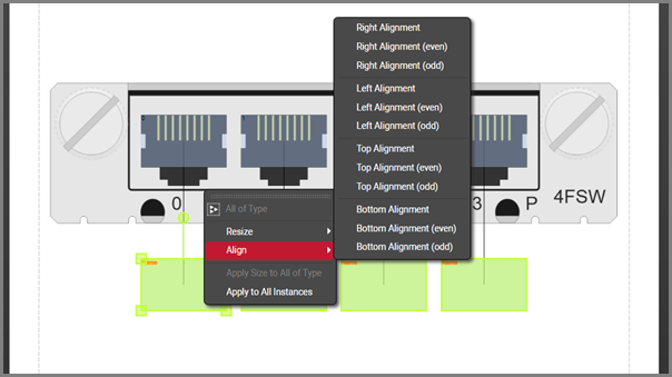
Right click context menu options for references
5.3.3.5 Working with text and displayed fields
As explained above, ports can have an unlimited number of custom fields, and you can choose which ones will be displayed on the diagram by default. Port and reference port displayed fields can also be set in advance in the modeler so that they follow a pre defined pattern for each instance in the project. This saves time when creating nice looking card diagrams. Users can edit each text by double clicking on the displayed field or by right clicking on it and selecting ‘Text’. Text can be resized and also rotated using the rotation handler.
To select which fields should be displayed by default, simply select the port and check the applicable fields on the properties window, as shown below.
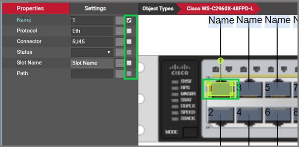
Port displayed field selection
5.3.3.6 Modeling reference node display field positioning
Selecting a reference node will display a list of all the “port” fields available. These fields can be used to pre-define the default position of a reference node displayed field.
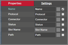
Reference node display field selection list
By placing a check mark next to the field name it will enable the field within the modeler. Ultimately this will make the field data for this field type display when the card is used and a connection exists with this port.
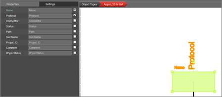
Reference node fields marked for display
5.3.3.7 Modeling slots for cards
In addition to modeling ports you can model slots by clicking on the add slot button in the insert menu. We will not go over this in detail as it is not a very common operation and it works exactly the same as with devices.
5.3.4 Special card fields
As we have seen with racks and devices, once a card type has been created, it contains three mandatory fields that exist for every instance of a card type in the project:
- Id: a 14-digit system-generated number (not visible on the field list view)
- Name: the field that will store the name of each instance
- Type: the field that stores the type of card
Card types also contain a few special fields: environmental properties that a user can edit on a per instance basis and are inherited from the type once you start instantiating them in the project. These special card properties are the following:
-
Peak Power [W]: this is the predefined static nameplate power value assigned to the type. Typically, the value entered here is the nameplate power published by the vendor.
-
Weight [lb.]: this is the predefined static weight published by the vendor.
-
Status (non-mandatory): a value usually associated with the ability of the card in a production environment to respond to a request.
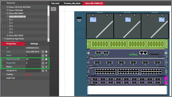
Card special fields
In sum, all card types contain at least five system fields. Below is the list of all system fields that exist for a new card type that was just created in the catalog:
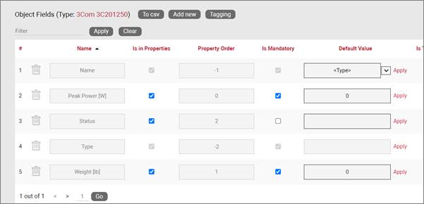
Minimum set of fields (system fields) for cards
Besides the name, which you can edit using one of the default value auto naming functions, notice the two editable environmental fields, which you can edit:
- Max weight
- Power [W]
As mentioned previously, these two fields are inherited by every instance of the card type and can be edited (or overridden) in the project on an instance-by-instance basis.
5.3.5 Custom card fields
We have seen this before for devices and racks: in addition to modeling your types according to your specifications, you may want to create custom fields that represent other properties of the card instances. To create a custom property for a card type, go to the card types list and follow these steps:
- Click on the hyperlink that shows the number of fields (5, when there are no custom fields)
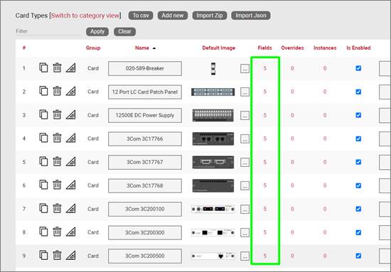
- This will take you to the fields list for that card type. Click on the ‘Add new’ button
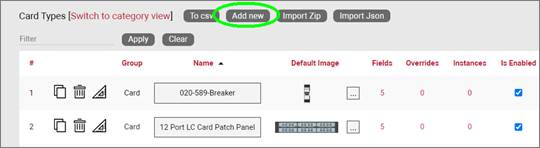
-
This opens the dialog for adding a new field, where you:
-
name the field
- pick a default value for your field
- pick a font size for the field, if it is displayed on the diagram
- set the field as mandatory during the data entry process
- set it as displayed, so that when it is filled out, that value shows up on the diagram (usually next to the card)
- pick a font color for the field, if it is displayed on the diagram
- pick a fill color for the field, if it is displayed on the diagram
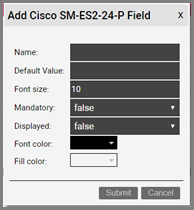
Once the field has been added you can then edit any field parameters from the fields list, as seen previously:
- Name: the field name that will be displayed for the associated object type.
- Is in properties: this feature is useful to control what end users can see on the properties window for a given instance of that type. For example, you can uncheck a field and prevent end users from seeing the data associated with the instances on the project.
- Property order: this is self-explanatory and lets you choose the order in which the property appears in the properties window of the project when you click on an instance of that type
- Is mandatory: if this option is checked it means that some data must be entered into the field when an object instance is created in the project. This is typically used in conjunction with an assigned default value to ensure some data is entered into this field. This field also cannot be deleted if the mandatory check box is enabled.
- Default value: this is the default value that will be displayed for a given field when a new instance of the object type is created. The apply button next to the field lets you apply the default value for that field to all instances of that type in the project.
- Is tree Label: determines the data value that will be displayed in the hierarchy browser. Change this if you want to see a different value displayed for an instance of this type in the hierarchy. The default is typically the name.
- List Items: list items are like drop down boxes (or combo boxes) that offer end users a finite set of values available for data entry on a given field for a given type. Click on the value to open a table with all list items associated with this field and object type.
- Overrides: click on the value to bring up a list of the overrides associated with this field and object type.
- Lock List: Allow an override list to be non-editable. If this is checked then a user cannot override the list values. They must choose a value that is already in the list.
- Is Unique (this type): Restricts all new inputs of this field for this object type to be unique across all instances.
- Is Unique (all types): Restricts all new inputs of this field for any object type to be unique across all instances.
- Is displayed: when checked, the field’s value will be displayed on the diagram for an instance of this object type. This can also be controlled on an instance basis as well as type-wide (see End User Guide).
- Justification: sets the alignment. See the settings for the field instance for more alignment options.
- Font color: the color of the text value that is displayed in the project area diagram for this field. Note that you can change the font on an instance by instance basis from the project as well (see End User Guide).
- Fill color: the background color of the text that is displayed in the project area diagram for this field. Note that you can change the fill color on an instance by instance basis from the project as well (see End User Guide).
- Font size: the size of the text that is being displayed in the project area diagram for this field. Note that you can change the font size on an instance by instance basis from the project as well (see End User Guide).
- Apply Font settings link: applies any font settings for this field to all instances of the object where the field is displayed.
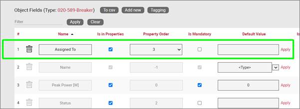
New custom field for a card type
5.3.5.1 Deleting a custom field
Deleting a custom field is easy: go to the fields list view for the card type and simply press the delete button on the left of the field you want to remove.
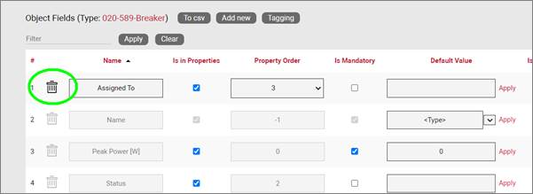
Deleting a custom field for a card type
Notice that the delete button is not enabled for system fields.
Attention!
As you might expect, all the values for the field corresponding to instances of that type in the project will be deleted. As such, be careful with this operation, since it cannot be undone.
5.3.6 Creating list items and visual overrides for a card field
Just as with devices or racks you may want to set your own visual overrides for cards. You can access the list items and visual overrides list for a card type field by clicking on the override number, as shown below:
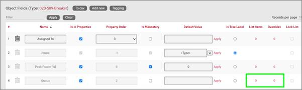
Visual override and list item link for a card field
To create a new list item or visual override for a card type field, go to the fields list and follow these steps:
- Click on the hyperlink that shows the number of overrides (obviously 0 when there are none)
- This will take you to the overrides list for that card type. Click on the ‘Add new’ button
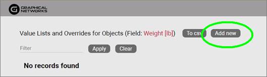
-
This opens the dialog for adding a new override, where you:
-
provide the value that will trigger the override (in the case of a simple list item this is just the list item value)
- specify whether this is an override or not (if you choose false then this completes the process for adding a list item)
- choose the rule that will trigger the override (equal to, contains, greater than, less than)
- set the override image
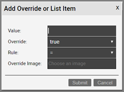
Once the override has been added you can then edit any parameters from the overrides list, as seen before when analyzing nodes:
- Value
- Rule
- Is Override
- Override
- Instance effect
- Parent effect
- Upwards propagation
5.3.6.1 Deleting an override or list item
To delete an override or list item for a card field go to the overrides list view for the card type and field and simply press the delete button on the left of the entry you want to remove.
6 Special objects
netTerrain has a set of predefined categories of objects (a.k.a. “special objects” or “other objects”) which are mostly used as an additional “decoration” or “collaboration” layer in addition to nodes, smart objects and links.
This section includes the “palette” objects (documents, comments, shapes and stamps) as well as free graphics. Palette objects can be added to a project clicking on the palette object icon under the insert menu or using the diagram right click context menu.
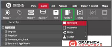
Palette objects button on the project side
Property tags are also grouped here for convenience, although strictly speaking they do not represent objects.
Users can customize these objects by adding their own fields to them, among other features, and they can be accessed from the “other objects” section in the catalog dashboard.
“Other objects” section in the catalog dashboard
6.1 Palette object and picture fields
Customizing a palette object type or free picture type simply requires clicking on the field link, next to the appropriate group, as shown in the previous screenshot. The user will be taken to a list view, like the ones used for regular catalog objects.
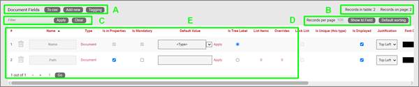
Example of a field list for documents
The different sections or features comprising this list field are like other list fields seen before:
Section A
- To CSV: this button will export the table’s data into a downloadable CSV file.
- Add New: clicking this button will display a form for creating a new field.
- Tagging: the tagging button opens a tagging selection dialog, allowing you to assign a set of fields to a “Tag” (a label). All existing tags appear in the settings tab for a diagram in the netTerrain project. Fields associated with a tag label can be turned on and off within a diagram.
Section B
- Records in table: displays the total number of fields in the table.
- Records on page: displays the total number of records on the table page that you are currently viewing. The records per page default value can be set by the administrator within the admin console.
Section C
- Filter: allows you to filter information in the current table view. If you would only like to display the fields called IP Address, then you simply type in the search criteria into the filter box and press the ‘Apply’ button. You can change the filter by typing in new criteria and pressing the ‘Apply’ button. If you no longer need the filter press the ‘Clear’ button.
Section D
- Records per page: you can easily change the records per page value to something less than the default value. So, for instance if the default is 100 records per page and you would like to see 50, simply proceed to change the value. Note that the default value is set in the admin console and can only be changed by an administrator. You cannot exceed the maximum number of records per page that was set within the admin console. If the maximum records per page is 500 then you will not be able to set a value higher than 500.
- Show ID Field: hides or shows the ID value for the record. The ID value is the unique ID that is assigned to record in netTerrain.
- Default Sorting: if you sorted the table by a column name and would like to return the table to the default sort value press this button. The default sorting for a table view is by “Name”.
Section E
- #: the row number for the current table view. This will change depending on the filter, sort value or number of records per page. Bear in mind this # is just a reference to the order in which the record appears in the visual representation of the information on the table and has no relationship to the actual data stored in the database.
- Options (no label): right next to the # button there are two options under a blank heading (‘Apply’ and ‘Delete’). Using the Apply button will assign any settings that are changed for this field to all instances of the object that the field is being used on. Selecting Delete will remove the field record. If the field is in use and there is data being stored within the field all this data will be lost so be careful when using this option.
- Name: the field name that will be displayed for the associated object type.
- Type: Object that the field is associated with.
- Is in properties: this feature is useful to control what end users can see on the properties window for a given instance of that type. For example, you can uncheck a field and prevent end users from seeing the data associated with the instances on the project.
- Is Mandatory: if this option is checked it means that some data must be entered in the field when an object instance is created in the project. This is typically used in conjunction with an assigned default value to ensure some data is entered in this field. This field also cannot be deleted if the mandatory check box is enabled.
- Default value: this is the default value that will be displayed for a given field when a new instance of the object type is created.
- List Items: list items are like drop down boxes (or combo boxes) that offer end users a finite set of values available for data entry on a given field for a given type. Click on the value to open a table with all list items associated with this field and object type.
- Overrides: overrides are rules associated with one or more fields for that type. Clicking on the overrides # will redirect you to a table with all assigned overrides (more on that later).
- Lock List: Allows an override list to be non-editable. If this is set, then a user cannot override the list values. They must choose a value that is in the list.
- Is Unique (this type): Restricts all new inputs of this field for this object type to be unique across all instances.
- Is Unique (all types): Restricts all new inputs of this field for any object type to be unique across all instances.
- Is displayed: when checked, the field’s value will be displayed on the diagram for an instance of this object type. This can also be controlled on an instance basis as well as type-wide (see End User Guide).
- Justification: sets the alignment. See the settings for the field instance for more alignment options.
- Font color: the color of the text value that is displayed in the project area diagram for this field. Note that you can change the font on an instance by instance basis from the project as well (see End User Guide).
- Fill color: the background color of the text that is displayed in the project area diagram for this field. Note that you can change the fill color on an instance by instance basis from the project as well (see End User Guide).
- Font size: the size of the text that is being displayed in the project area diagram for this field. Note that you can change the font size on an instance by instance basis from the project as well (see End User Guide).
6.2 Field or property tags (layering)
As explained in previous sections, property tags allow you to associate fields to a “tag” (i.e. layer or label). All existing tags appear in the settings tab for a diagram in the netTerrain project. Fields associated with a tag label can be turned on and off within a diagram. So, you could assign a field like IP Address to a “Hide IP” tag. If you happen to be on a diagram that has objects containing that field, you could then turn all IP Address fields on or off without having to individually uncheck them from the properties window for each instance. There is a system tag named ‘Uncategorized’ in the diagram settings panel that when toggled affects the display of all fields.
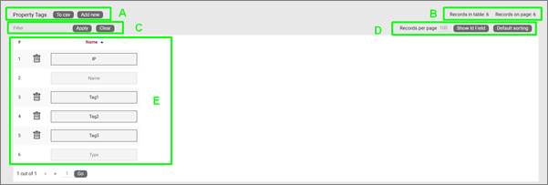
Property tag list view
Let’s review each section of this list view:
Section A
- To CSV: this button allows you to export the table view to a downloadable CSV file.
- Add New: clicking this button will display a form for creating a new Property Tag.
Section B
- Records in table: displays the total number of tags in the table.
- Records on page: displays the total number of records on the table page that you are currently viewing.
Section C
- Filter: allows you to filter information in the current table view. If you would only like to display the objects related to “Cisco” in their name, then type “Cisco” into the filter box and press the ‘Apply’ button. You can change the filter by simply typing in new criteria and pressing the ‘Apply’ button. If you no longer need the filter press the ‘Clear’ button to remove the filter.
Section D
- Records per page: you can change the records per page value to a value that is less than the default value. So, if the default is 100 records per page and you would like to see 50 then change the value. Note that the default value is set in the admin console and can only be changed by an administrator.
- Show ID Field: hides or shows the ID value for the record. The ID value is the unique ID that is assigned to record in netTerrain.
- Default Sorting: if you sorted the table by a column name and would like to return the table to the default sort value press this button. The default sorting for a table view is by “Name”. Changing the default sorting is temporary. The default is restored once you navigate away from the table view.
Section E
- #: the row number for the current table view. This will change depending on the filter, sort value or number of records per page. Bear in mind this # is just a reference to the order in which the record appears in the visual representation of the information on the table and has no relationship to the actual data stored in the database.
- Options (no label): the ‘Delete’ option allows you to delete an object. Note that you can only delete an object if it is not being used in netTerrain. If it is being used, you would need to remove all instances of the object before you can delete the object.
- Name: The name of the tag. Tagging of fields can be setup within the field summary pages of the catalog or by selecting an objects field list.